

Colours to Use in Your Home in 2019
Top Image Credit Little Green
COLOUR.
It is deeply personal when you choose it for your home. Be it dark, inky walls that make you feel cocooned or light, bright and airy spaces. For some, who tend to the dark side of the spectrum, they can’t imagine living with “bland” neutrals, because these dark colours are restful, relaxing, a bit like giving yourself a big hug. Those that like light neutrals, might find dark colours oppressive or gloomy.
Regardless, if a colour works for you, and really works for you, because you cannot imagine your room any other way, then you have hit the colour jackpot. Finding your own colour style is as important as finding your design ethos. I’d argue it is about owning your colour taste levels and not being afraid to be judged by them. So what if all of your friends live with magnolia walls but you like deep green? It is about you being comfortable in your home, to create that sense of “being home”.
I’m going to delve a little into the colour trends for this year, but before I do, I just wanted to argue that just because something is “on trend” this year, does not mean that it will be “off trend” next year.
If you want a great example, you just need to look at velvet. I had started writing a piece on the velvet trend for 2019, but then I realised that velvet was a big trend in 2018, indeed it was the year before. I have had velvet in my home since 2015. In all likelihood, velvet will be around next year too.
So, I guess what I am saying is just because something is not on trend this year, does not mean it has completely gone from interiors; the colour grey being a great example of a colour that has been around a long time, is starting to moving off the trend radar, but which is still a beautiful colour for your home.
As someone who doesn’t particularly follow trends, I’d say go with what you like. Having said that, the colour trend this year lends itself to a comforting home, so it is certainly worth considering if you have decor plans on the horizon.

Image Credit Farrow and Ball
2019 is the year of subdued, comforting tones intended to introduce a sense of calm and serenity. As you read through this blog post, you will pick up on descriptions such as “nurturing”, “wellbeing”, “relaxing” ,“comfort”, “warmth” when it comes to paint colours, as we see our interior decisions move towards how we enhance our wellbeing, and relaxation in our home. How we de-stress from modern 24-hour culture and find a place to relax. And the colours we choose, and have been chosen through trends, are a big part of creating that feeling.
The New Neutrals
50 shades of grey have dominated the interior world in recent years. However, we are seeing a shift towards warm, earthy neutrals; in other words, beige. Not magnolia, but softer and with less yellow. Think “greige” (a grey type of beige).
Below you can see Jitney, one of the new colours from Farrow and Ball which captures this tone beautifully. “This earthy colour sits somewhere between the more traditional Oxford Stone and greyer Elephant’s Breath. Though muted, it is incredibly uplifting and reminds Farrow and Ball of lazy days by the sea – hence sharing its name with the bus that whisks NewYorkers out of the hot city to the similarly coloured sandy beaches of the Hamptons.”

Image Credit Farrow and Ball
Despite grey reaching the end of its trend curve, we will still see softer shades appearing this year.

Source Elle Decor.
Benjamin Moore, a leading American paint brand’s offering for Colour of the Year, Metropolitan AF-690 is a soft grey designed to introduce a calming, balanced vibe into our homes.
Ellen O’Neill, Benjamin Moore Director of Strategic Design Intelligence.
“Metropolitan AF-690 exudes beauty and balance. It’s a colour in the neutral spectrum that references a contemplative state of mind and design. Not arresting nor aggressive, this understated yet glamorous grey creates a soothing, impactful common ground.”
Other warm neutrals are on trend this year. A warm white, for example as seen below; School House White by Farrow and Ball.

Image Credit Farrow and Ball.
Warm Autumnal Neutral Shades

Image Credit Farrow and Ball
Dulux’s Colour of the Year “Spiced Honey” picks up on this neutral trend. This colour will see the lighter fresher neutrals through to autumn where the warmth in the colour, especially teamed with a dark burgundy or deep pink, will cosy up our homes for the darker nights and colder weather. “Spiced Honey can be both calming and nourishing or stimulating and energising, depending on the palettes and light surrounding it,” explained Heleen van Gent, Head of the Global Aesthetic Centre, who chairs the ColourFutures™ panel annually. “The contemporary hue is versatile, sophisticated and timeless and lends itself to a broad spectrum of life and interior styles”.
Similarly, Sulking Room Pink from Farrow and Ball, where we have seen the lighter, slightly girly pink move to a more sophisticated hue, is another colour that is capturing the imagination at the moment. “Not to be seen as overtly pink, but rather a muted rose with enormous warmth, its powdery feel makes it incredibly soft and easy to use with complementary tones. Sulking Room Pink is evocative of the colours so often used in boudoirs, a room named after the French ‘bouder’ - to sulk. “

Image Credit Dulux

Image Credit Little Green
Green
Is green becoming the new grey?
Certainly, I’d argue we are seeing 50 shades of green appearing in interiors; from a dark, almost black/grey Obsidian Green from Little Green, to an olive green such Jewel by Little Green, to fresher greens such as Bancha from Farrow and Ball’s new collection, see below, and moving towards Neo Mint Green for 2020 (a fresher take on green according to trend predictors WGSN. which you can read more about here.).
This comes as no surprise given the psychology around this colour which I wrote about here, where green has many restorative qualities, and the fact it is a great colour in which to embrace the biophilic design trend.

Image Credit Farrow and Ball
Comforting Blues
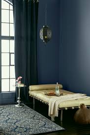
Image Valspar Paint
Blue is one of the world’s favourite colours and the most searched for colour in interiors. Blue kitchens are a trend for 2019, according to leading interiors magazine Living etc., but we shouldn’t just limit the colour to woodwork or kitchens, as painting your walls in blue can create really help create the right feeling for you interior space.
Blue is the colour of the mind, affecting us mentally. Intense, dark blues stimulate clear thought. Lighter, softer tones of blue calm the mind and are serene and calming.
Jason de Kauwe, Marketing Communication Manager at Valspar:
“Shades of blue connote feelings of calm and serenity and it’s often the colour we look to when trying to balance our fast-paced lifestyles. Blue can also provide a sense of escapism due to its association with the sky and the ocean.”
As someone who has embraced colour for as long as I can remember, I still sometimes find it difficult to get the right colour for me. Sometimes I just get it wrong, the colour is the wrong shade. However, it is worth persevering since should you get it right, colour can really transform your home.
It is fascinating to see how paint trends move to reflect the cultural changes around us. How the move to create our home as a haven is reflected in the nurturing or soft hues we are seeing trending in paints at the moment. As a longstanding advocate of using colour to create a “feeling” in my home, in part due to the fact I have a very busy job and travel lots, I can empathise with this trend.

The Girl with The Green Sofa


