

The Colour Blue and the AI Aqua Trend for 2021
Top Image Credit. Graham and Green.
Trends. Do we follow them anymore? Should we? Are they not a nod to consumerism of days gone by, where we all rush out to buy the latest trend only for it to be obsolete in a year’s time. Consuming and wasting.
Not necessarily, since in the macro environment, interior trends are geared towards conscious buying, sustainability, recycling, a culture geared towards environmental consciousness. Creating homes that sustain us, allow us to relax, to retreat into. And even at the micro level, embracing a small part of a trend, especially if you are planning to decorate in any event, or you need to buy homewares or dinnerware, for example, does not pit you against this movement.
So, I’m going to explore a colour trend predicted to be big in 2021 in fashion. Yes fashion. Because, what we see on the catwalk will almost certainly make its way into our homes in one way of another. We’ve seen it with millennial pink, we are seeing it with yellow, and we will see neo mint green heading into interiors, shortly. Neo Mint is already popping onto the catwalk at the likes of Prada and is expected to be big next year. A recent visit to Royalty Doulton indicated that it is their colour of choice for dinnerware for 2020.

Image Source. The Warsaw co-working space.Thespaces.com
But looking ahead, 24 months in fact, because that is what trends forecasters WSGN do, combining social science and instinct to predict what is coming into stores and our homes in the future; it’s blue. AI Aqua to be precise.

Image Source. Coloro
According to WGSN, in conjunction with Coloro, “A recent survey of the tones used on the world’s biggest websites found blue easily outstripped others, and shades of blue used prominently in tech are set to become more immersive. The hyped concepts around augmented reality (AR) and artificial intelligence (AI) that were out of reach for many will become readily available and closer to reaching their full potential,” says WGSN. “With a digital quality that is set to have key relevance in 2021, A.I. Aqua is our tech-inspired hero colour to watch.”
“A.I. Aqua offers true versatility. As fashion and lifestyle trends cross-pollinate more rapidly, we predict A.I. Aqua will have major commercial appeal. A.I. Aqua is an emotional tone that triggers focus and clarity.”
The Psychology of Blue
Since A.I. Aqua is predicted to trigger focus and clarity, I thought it worth dwelling on the psychology of blue, as I have done with other colours in this series of blog posts.
Blue is one of three primary colours. It is the colour of the sky, the sea, a colour known for association with trust, responsibility, honesty, loyalty harmony, faithfulness, confidence but can sometimes be perceived as cold, icy. The paler the colour the more freedom we feel. But be aware it can create sadness.
Think about lying back and staring out at the ocean or the sky. How does it make you feel? Calm, peaceful, free?
Blue is a popular colour amongst companies, hospitals and airlines due to its ability to inspire trust, strength and wisdom. It is the colour of creativity and intelligence. It does not work well with food, however, since there are very few blue coloured foods, at least occurring naturally that is. In fact, it is an appetite suppressant.
The tone of blue represents different things:
Light Blue represents health, healing, tranquillity, understanding and softness. Therefore, expect to see more light blue in a hospital environment.
Dark Blue is associated with knowledge, power, integrity and professionalism. Therefore, expect to see darker blue, or touches of it in a corporate environment.

Image Credit unknown.
The Use of Blue In Interiors
Blue is one of the most popular colours in interior decorating. It is often described as most people’s favourite colour.
We have seen a big movement in navy blue kitchens, replacing grey and black of recent years. In 2018, kitchens were all about inky blue cabinetry with copper and brass accents. Surprising, given blue is considered to be an appetite suppressant, or maybe because of it! It would seem that blue is breaking all the rules in the kitchen.
According to Living etc. searches for blue kitchens are up 93% and they are set to continue as an interior trend through 2019, whether it is used on cabinetry, walls, tiles or floors.

Image Source. Living etc.
Blue would work well in a study where it inspires intelligence or in a bathroom or bedroom where its calming side plays out. Think of all the calming blue and white interiors typical of American coastal homes. Blue is one of my colour predictions for 2019 which you can read about here.
In 2017, Dulux chose “Denim Drift” as a key colour, last year Farrow and Ball included blue “De Nimes” in its new collection. There are invariably going to be a number of different shades available on the market at present in pretty much any shade, although blue is trending at the darker end of the spectrum. Many people shy away from using blue in their home, perceiving it as cold. But, as someone who has a deep navy colour in my kitchen, in a north facing room, I can honestly say that the colour comforts and warms up the room. Inevitably it will be about choosing the right tone of blue.
Jason de Kauwe, Marketing Communication Manager at Valspar:
“Shades of blue connote feelings of calm and serenity and it’s often the colour we look to when trying to balance our fast-paced lifestyles. Blue can also provide a sense of escapism due to its association with the sky and the ocean.”
This is the very reason it is on trend this season with macro trends heading towards creating homes as retreats from our fast paced world.
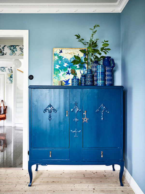
Image Source. LHS Italian Bark. RHS Farrow and Ball.
So, moving back to the trend for 2021, A.I. Aqua and how you can incorporate this colour into your home. Unlike dark blue, aqua is refreshing, it brightens up a space. It really is a spring and summer colour when used in abundance.
Personally, I prefer aqua as an accent colour, against a dark navy wall or perhaps a more neutral scheme. While the Warsaw co-working space you can see in the image towards the top of this blog post is visually beautiful, I would find it difficult to live with a room covered entirely in this colour.
Aqua brightens up darker or neutral schemes, whether it be tiles in a white kitchen (see below) or accessories in a neutral white or “beige” room.
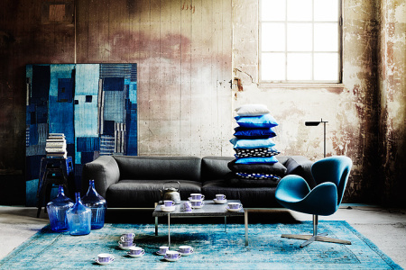

Image Sources. LHS. Beautifulliving.wordpress.com. Middle. Fantasyva.com. RHS. luxxu.net
I already have a few aqua accents in my dark navy kitchen, not chosen because of an upcoming trend, but because they brighten and lift the space. So, if you too want to embrace the colour, perhaps a statement piece of furniture or through accessories, you can have a look at some ideas through my moodboard below.

Gisela Graham Chevron Vase. Hurn & Hurn. Alma Garden Dining Chair. Danetti. Blue Sofa: Cult Living. Wink Fringed Pendant Lamp. Audenza. Gerald Planter. Trouva. Voluptuous Glass Vase. Audenza.
So, if you want to be ahead of the interior curve, perhaps a touch of aqua for you home. Or, if not so far ahead go with mint green which I wrote about here.

The Girl with The Green Sofa


