

Elle Decoration by Crown
I love colour!
I’d say that’s something of an understatement and if there was ever going to be a paint collection that would make me want to redecorate my entire house from top to bottom, then this is it. Crown Paints have teamed up with Elle Decoration to create a whole new paint collection combining Crown Paints’ British colour heritage with Elle Decoration’s eye for leading design and it’s a stunner!
The paint collection which you can browse here or watch the video below, is based around 6 colour stories and features 60 multi-surface paints. There really is something for everyone in this collection, whether you love a riot of colour or prefer the more neutral end of the colour spectrum.
Given that Elle Decoration has its finger on the pulse of design trends, you’d expect this collection to be on trend so I’m going to run through some of the design trends that I see through this paint collection and spend a little time looking at my personal favourite colour schemes and how I’d use them. Any interior designer knows that colour has the power to transform a room. However, it is often tricky to get the right colour-to choose the right colour for you and your home, because colour is deeply personal.
My colourful, oftentimes inky coloured rooms are relaxing to me, rather like giving myself a big hug. For those that prefer Scandi neutral schemes for relaxation, my room schemes simply wouldn’t work for you. But I’d urge you to experiment, test your comfort zone because when you find a combination of colours that work, that’s where the interior magic happens.
The Colour Stories
Personal Touch and Pigment Matt Emulsion.
Crafted
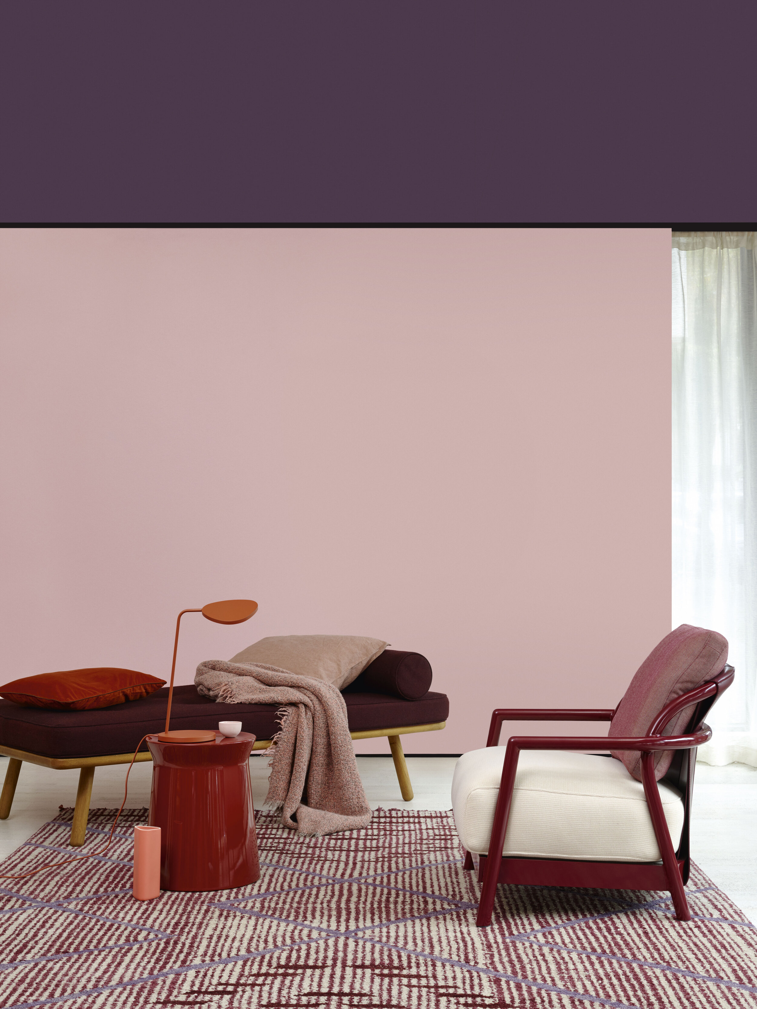
This is my favourite colour collection. When you see the Botanical collection below and know about my love of green, this might surprise you. However, this collection offers a diverse range of colours for someone wanting to add a bit or a lot of colour to their rooms, capturing a lot of colour trends for the coming year. Earthy, rich colour tones are on trend for 2020 and we are seeing a lot of terracotta coming into interiors, a colour that appeals to the need to connect with nature, yet is warm and inviting. Cushion Craze and Tufted Kilm are perfect colours to use from this collection if you want to bring some of this colour into your scheme. Mix with the lighter pinks in this collection as an accent colour, perhaps an accent wall if you don’t want to add too much of it. The image below shows you how to mix pink and terracotta successfully.
Throw in a little red such as Velvetine or perhaps a little plum/purple, such as Colorfast (perhaps by painting an item of furniture to add a pop of colour) and you have a lovely mix of vibrant, warm and earthy colours that are bang on trend, but also cocooning and inviting in your home.
Cushion Crazed and Tailored Matt Emulsion.
If you don’t want to create an entire room scheme using a mix of colours, perhaps you could create a piece of furniture that is bespoke to you. Sustainable buying is a big trend for 2020, so grab an old chest of drawers at a charity shop or off eBay and up-cycle it. You could add a terracotta (or plum or red) set of drawers to a pink bedroom. You could mix three colours on a chest of drawers creating a colour block effect. It takes very little effort to create a newly painted up-cycle (usually under a day) yet you are creating something entirely personal for your home.
Geometric paintwork, and the use of colour blocking are also big trends for 2020, so if you prefer a neutral scheme think about how you might add colour by emulating artwork either on a small part of your walls or on furniture.


The images above show some of my favourite colours in this collection-Tufted Kilm, Cushion Craze, Velvetine, Colorfast
You could simply paint a square block of colour behind a picture frame to add a small amount of colour and depth to a neutral room. If that is too much, paint the picture frame, or another accessory, you can start small until you build your colour confidence up.
If you want to stick to one paint colour, bring in colour through your accessories. Use this colour scheme to guide you as to what works well together. You could paint your walls pink and add a terracotta throw. Perhaps you are bold enough to buy a velvet bed in one of the colours to compliment the colour you have on the wall.
The possibilities are endless and most importantly personal. Because that is the only way colour will work for you.
Or simply stick to pink. Pink is showing no signs of disappearing from interiors at the moment. While there has been a shift from lighter pinks to more dusky pinks in recent years, pink is fast becoming a staple neutral colour and this collection has a large number of pinks to choose from.


Colours above are Handcraft, Tapestry Thread, Satin Lining, Personal Touch.

Botanical Noir and Trailing Plant Matt Emulsion.
Botanical
Inspired by nature, this collection features colours from a mint green of Revival (an on-trend colour for 2020) to a deeper emerald green of Enchanted Ivy, mustard yellow of Mustard Field to a more browny green of Forest Vista. Once again colours that can be used on their own or combined together.
This collection plays to the current trend of Biophllia, and our need to connect to nature, whether directly in our homes through plants, fire, water and air, or in the case of paint colours, indirectly. Connecting with nature in our homes and environment has been shown to have major health benefits-reduction of stress, blood pressure and heart rates, increased productivity, and self-reported feeling of wellbeing. Given we are spending 90% of our time indoors, adding some natural colours and textures is important to our wellbeing and relaxation in our home.


The images above show some of my favourite colours in this collection-Forest Vista, Mustard Field, Enchanted Ivy, Revival.
Green is perhaps the colour we associate the most with nature. It strikes the eye in such a way as to require no adjustment whatsoever and is, therefore, restful and soothing. It carries association with sincerity, health, fertility and good luck (green is the colour of a lucky clover). Dark green is associated with money.
We are seeing the use of green in interiors increasing a lot over recent years-people are moving from navy blue to green in kitchens, for example. More people are embracing green instead of grey on their walls. The image below with the brown toned, almost olive green of Forest Vista on the walls is soothing. Combine it with a fresher, brighter green such as emerald (at the dark end of the spectrum) or mint (at the lighter end of the spectrum) and you have a tonal colour scheme that is perfect for relaxation. I’ve used a similar colour to this in my bathroom, against the copper of my bath and radiator. As we are seeing a trend for hardware moving to warmer metals such as brass and copper, this tone of green is a perfect colour to use along side these.
If you want to add another colour in this scheme, add yellow. Yellow and green are from the same side of the colour wheel and combine beautifully. If you want a contrasting scheme add pink or red/orange tones. Combine this Botanical Collection with the Crafted collection colours above. Again, you can stick to one colour on your walls, and add accent colours through painted furniture, or simply through your accessories.

Forest Vista Matt Emulsion.
I wrote about the colour trends of Mint Green and Mellow Yellow in 2020 here and here .
Trend predictors WGSN are predicting neo mint green as the colour for spring summer 2020. A move away from more feminine colours of pink and yellow to a more gender-neutral colour of mint. We are seeing lots of mint green accessories filtering onto the interior scene this year. If you are like me and prefer the inky end of the green spectrum, add it as an accent colour to freshen up your room for spring. Revival is a good colour in this collection to add this trend to your home.
Trend predictors WSGN state “Yellow will start to feed into the mass market when it shifts to a deeper tone of mellow yellow, feeding into the popularity of earthy, baked hues”, Mustard Field in exactly the type of colour they are writing about, a warm, vibrant, earthy yellow that would warm up a hallway, perhaps against a darker brown or black. Go all out and paint you walls for an instant pop of happy, sunshine as you walk into a room. If that is too much colour for you, add it as an accent colour to blue, green or even pink walls.

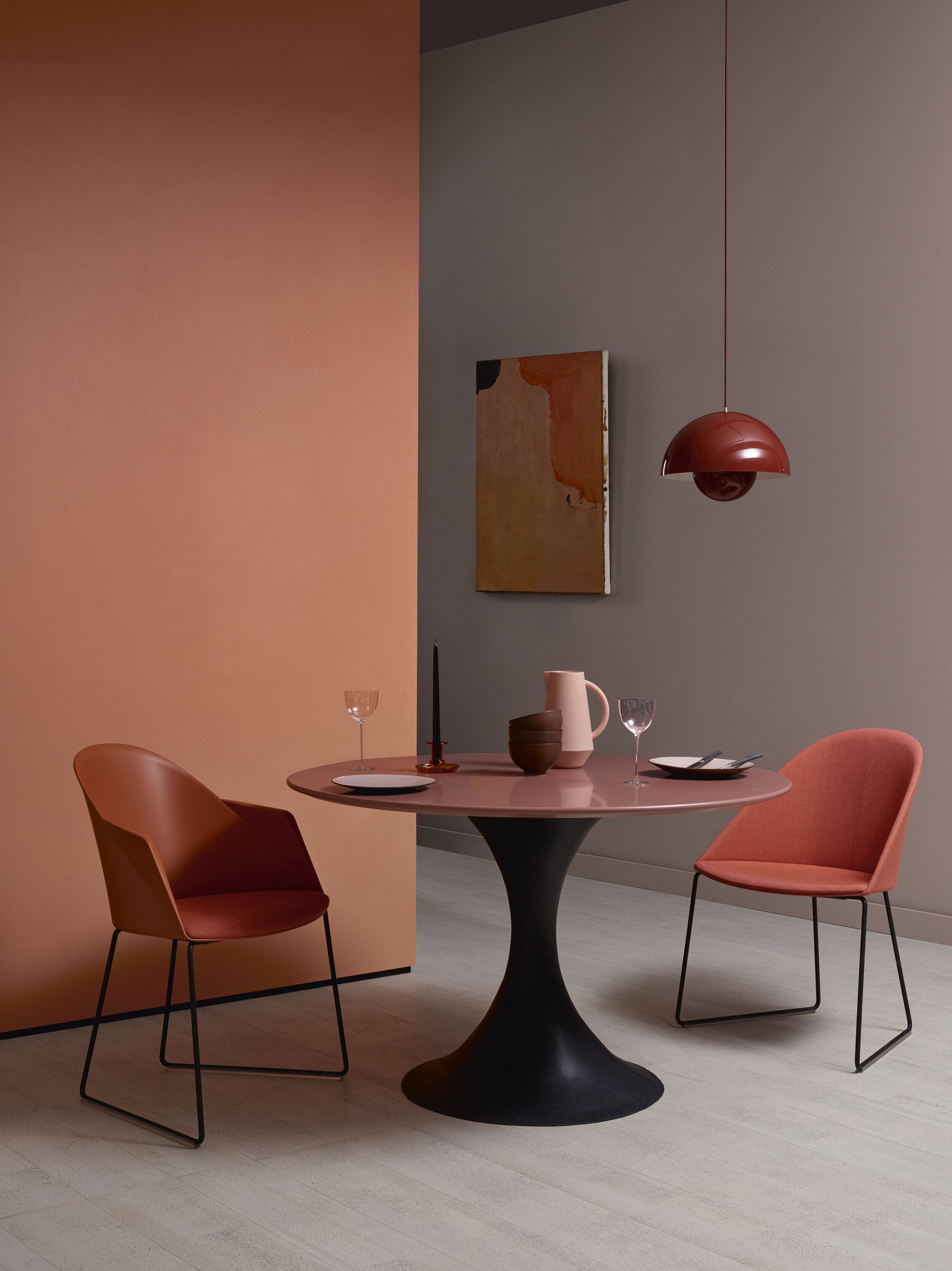
Open Water and Movement Matt Emulsion
Drift
A beautiful series of blues from the lightest “light breeze” to the immersive deep of “immersed” there is a blue colour for everyone.
Blue as a colour is both comforting and relatable. A sophisticated colour that evokes calm. Some may say that blue is a boring choice for interiors, that is has been used for years and doesn’t represent anything new. That dark colours are being replaced with neutrals. I disagree.
Firstly, blue is one of the most popular choices of colours to use in interiors, it is still an extremely popular colour to use in kitchens, for example, where navy works well with the warmer, metallic colours being used on handles and taps. It is often said to be most people’s favourite colour.
Inky Blues have to some extent started to replace grey in interior schemes over recent years. Inky colours remain on trend for 2020- jewel tones combined with a touch of opulence with gold and bronze accessories or rich coloured rugs.


Images above contain my favourite colours in the Drift Series-Light Breeze, Open Water, Movement, Immersed
“But blue must surely be cold in a North facing room?” I often hear. I don’t have a lot of blue in my home, but the one room where I have embraced a deep, inky navy is in my north facing kitchen/dining room. No colour is going to easily lighten and warm this room, so I chose to go deep, to embrace the darkness and it works. The room feels cosy and calm. My secret is that I have added a lighter blue to my accessories (aqua blue), much in the same way as the dark kitchen above has been lightened by a lighter blue wall, and I’ve complemented the inky walls with a deep, rich-red traditional rug and brown leather and wood.
Blue inspires trust and wisdom, it is comforting, sometimes tranquil and inspires integrity and knowledge. I predicted we will see lighter, almost aqua colours coming on trend in the next year or so, and some of the paler colours in this collection lend themselves well to this trend and to freshening up for spring.

Wave after wave Matt Emulsion
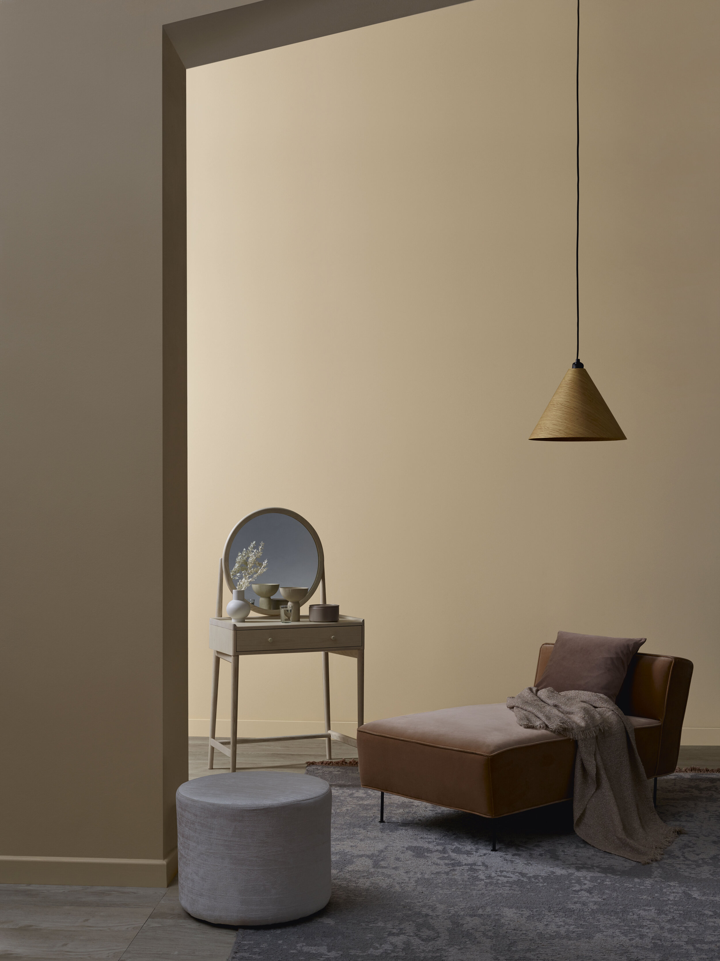
Now we move to the more neutral end of this collection with Obsidian; a collection of soothing, earthy monochrome shades, Powder; a collection of warm neutrals and Feather; a modern twist on white.
We have seen a big move towards neutral colours over the last year and it is a trend that is continuing. Key to the neutral interiors trend is by keeping the overall look of your room simple, pared back and considered, rather than painting your walls in a number of neutral colours. Sometimes it is okay to add a couple of colours to add depth to the scheme, you will see this in some of the images below- how a darker neutral enhances the lighter- but really it is about adding texture to a room scheme, be it in the soft furnishings, or perhaps directly to the wall by using panelling. Neutral colour schemes benefit from using wood, often rustic, or leather, rattan, sisal- textural elements that are also neutral. Black can ground a very light neutral scheme so I can see the Obsidian collection working well with the Feather collection in a Scandi scheme.
Delicately Dark Matt Emulsion
Powder
50 shades of grey have dominated the interior world in recent years. However, we are seeing a shift towards warm, earthy neutrals; in other words, beige. Not magnolia, but softer and with less yellow. Think “greige” (a grey type of beige). This collection fully embraces this design trend whether you prefer the lighter end of the spectrum or the darker end.
Make sure to add plenty of texture to these rooms, be it a statement rug, a tactile leather or velvet statement chair or sofa, wood, and even wool and tactile fabrics.


Images above contain some of my favourite colours n this collection-Delicate Touch, Delicately Dark, Flawless, Blended.

Natural Look Matt Emulsion

Black Glass Matt Emulsion

Rock Solid and Sculpture Matt Emulsion
Obsidian
Despite grey reaching the end of its trend curve (trends usually last 10 years, grey has been around 7-8 years), we will still see softer shades appearing this year, which this collection embraces with colours like Crystallised, Pure Minerals and Crushed Moonstone. Most Interior designers now agree that black or very dark grey is now considered a neutral tone, and Absolute Granite and Black Glass are two such colours. Darker neutrals can help ground an otherwise light neutral scheme, and you often see black in Scandi Interiors.


Images above include my favourite colours from this collection-Bare Concrete, Sculpture, Black Glass, Absolute Granite.
Many of the colours in this collection have an earthy, brown tone to them; Sculpture, Rock Solid, Side Walk and represent the darker end of the “greige” neutrals that are on trend at the moment.
These colours are soothing, restful and create calming environments in which to live. Team some of the earthier colours with pink if you want to add a spot of colour.

Bare Concrete Matt Emulsion.
Feather
Because we all need white somewhere in an interior scheme. This collection explores the ethereal quality of white with both warm and cool options. Combine with Obsidian or Powder collections in a neutral of Scandi Scheme.

Heartfelt Matt Emulsion


Images above contain some of my favourite colours from this collection-Angelic, Heartfelt, So Gentle and Nestled.
Finally, a bit more about the paint and the collaboration.
The Paint
Offering the perfect matt finish, Elle Decoration by Crown Paints is a premium, durable collection which is 200 times tougher than ordinary emulsion. This means that it is highly scrubbable, for those of you like me with kids that are prone to leaving sticky finger prints on newly painted surfaces, or worse prone to kicking footballs at the walls. Made with the Breatheasy® formula, it is 99% solvent free, better for the environment and virtually odour free, allowing users to return to the room in less time. Crown was first to market with this breakthrough product in 2001. ·Prices start from £35 for 2.5L tin. Tester pots (125ml) available for £4. Local stockists can be found via the website: https://www.elledecoration-crownpaints.com/en/stockist.
The Collaboration
Elle Decoration has 25 editions and over 10 million readers worldwide and is the world’s highest-selling luxury modern interiors magazine. Founded in France in 1987, it has over 33 years’ experience and is today a globally respected authority on interior design.
Crown paints can trace its heritage back to 1777 and the factory stands opposite the Crown Paints headquarters in Darwen (Lancashire) on the original site to this day. In 1949 Crown was granted its first Royal Warrant as supplier to King George VI, with the warrant then renewed six years later by Queen Elizabeth II in 1955.
As of June 2018, Crown Paints is the first UK paint manufacturer to launch paint containers made from 100 per cent recycled plastic. This marks ten years since they started the earth balance sustainability programme. In 2008, the earth balance sustainability programme was launched, setting out with a commitment to be more sustainable, less wasteful and to help customers make responsible decisions about our world. The programme has won a number of awards in recognition of its success.
This is a paid partnership blog post, but all interior trends opinions are my own.


