A Colourful Victorian Semi-Max Made Me Do It
Tonight’s Home Tour is one of my favourite houses, decor wise. A love of colour, wallpaper and vintage items are exactly the kind of thing that make my heart sing, and the choices of colours in this home are absolutely perfect. This is a fairly recent renovation, including the loft room, and I’m sure you will agree it is sympathetically done.
Meet Carol Maxwell who runs her own print business from home. Although this is not a business spotlight focus I would recommend you take a look at her beautiful prints too.
Tell me about your home, where do you live and in what kind of house?
We live in a Victorian semi-detached, in Forest Hill south east London.
We moved in when Max was 8 months old, and while it was the best house we saw at the time, it probably needed more work than we realised. However, it was a complete blank canvas as the whole house was painted off white. We lived in it for a good year before we started renovating
Who lives there with you, how does your home work for you and your family?
I’m in a house full of boys, my Fiancée Tom, Max, 6 (my business name sake), Milo who’s 2.
The house has evolved and changed a lot as our needs have changed over the years.
When we bought it, the house was sold as a 4 bed, however 2 of them were very small and we had an even tinier bathroom, so we turned one of the box rooms into our family bathroom and the tiny bathroom became my tiny office. I hadn’t even started 'Max Made Me Do It' at the time but I still needed a desk space as I was a freelancer print designer for fashion.
After a couple of years, we had Milo and my business had grown considerably so this layout was no longer working for us.
We had always planned on doing a loft conversion and the time had come, but by this point I also needed a proper studio, but we didn’t want to lose our spare room as our family come over from Ireland a lot. So, we decided to knock through the bathroom, my tiny office and Max’s little box bedroom and make one large family bathroom and a guest room. Best decision ever!
We then created a master bedroom with ensuite in the loft and extended out to create a space which became Milos room. The old spare room became Max’s bedroom and our old bedroom became my studio which is a dream come true for me. It was 7 months of renovations last year, as we also did the hallways and revamped the kitchen but it was so worth it as we now have the perfect layout for all of our family's needs.
How do you describe your style?
I would say I am vintage girl at heart, I think vintage pieces are key to truly creating a unique home with character. I’m told all the time that I am really brave with my colour choices, but it’s very instinctive for me and I always go with my gut feeling. I’m also drawn to the dark side and love deep rich dark tones but also like to play with colour and use combinations that you might not expect. There is not a single white wall left in our house however green and pink have definitely become a theme in our house, I like to mix new with old and stay true to the original character of the house. In short, our house is an eclectic mix of vintage and new pieces, full of art, with a nod to retro glamour and full of colourful surprises.
What influences you, where do you find your inspiration for decorating?
In recent years, I would be lying if I didn’t say I found inspiration on Instagram and Pinterest of course. There are so many inspiring interior accounts and blogs out there now, and we are being constantly bombarded visually with newness. But even as a young child I was fascinated by old houses, they have so much character and I love furniture and objects that have a history and a story to tell. Charleston house in Lewis which belonged to the Bloomsbury set is a huge source of inspiration to me. I travelled a lot in my 20’s so that also was a source of inspiration and I still have little things around the house that I bought on trips from flea markets and paintings and ceramics we’ve bought on holidays.
My own work as a print designer and illustrator has subconsciously influenced my decorating choices particularly in our recent renovations, for example the two-colour ways I offer to customers for my most popular letter prints range are green and pink and gradually these colours have made their way into various rooms in the house.

THE FAMILY BATHROOM
This was the first room in the house that got the pink and green treatment. I had a very clear vision for this room from the beginning and created a mood board when I was researching it. This helped me to stay focused. The starting point was the large green vintage metal French mass sign that we had in our old bathroom. I knew that I wanted to use this so that made me decide on green for a colour. I also knew I wanted brass hardware which I sourced from an Italian company Bespoke Taps, they are amazing and make everything too order and offer so many finishes. The hardest obstacle was finding tile and other finishing touches in brass but after a lot of hours online I did it. The vanity unit was an old desk that we were going to get rid of, but I up cycled it by painting it, changing the handles and getting a local marble supplier to cut a marble “off cut” piece to size. I’m so happy with the result and I love that it is a one-off piece. The green tiles are Bert & May Siham tiles and the pink ones are from Topps Tiles, I painted the one remaining wall and cupboard, which hides are boiler and provides storage, in F&B Studio Green.
The overall feel is glamorous with and to both the 50’s and Art Deco times.
THE GUEST BEDROOM
As we essentially created this room I wanted to add character so got my builder to put up the panelling. This was cheap and easy to do but really adds something to the room. The walls are painted in Farrow & Ball Inchyra blue and sit alongside the vintage palm print curtains really nicely. This room is so cosy and peaceful and I love how it looks out on the garden. It’s also next to the family bathroom (which the boys only use really) so when guests come to stay it’s almost like they have their own private corridor as the rest of the family are at the opposite end of the house.


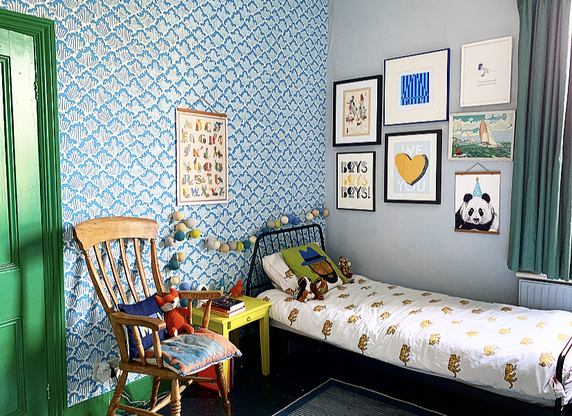
MAX’S BEDROOM
I have just given this room a revamp in time for his 6th birthday. We did decorate it a couple of years ago before we had Milo when it was the old spare room. I am a massive fan of Farrow & Ball and have used their colours in some capacity in every room in the house. We papered one wall in their Aranami paper in the blue colour way and teamed it with Parma Grey on the walls. But to make it feel more like Max’s room I wanted to add some colour as I really believe kids rooms should be colourful and playful. I painted the fireplace, skirtings and door and frame in Valspar’s cricket field green. I love it so much as it’s so bright and fun and looks so fabulous against the Farrow & Ball wallpaper.
We rehung the huge vintage original Polish Cyrk poster that used to be on our old landing in here above the fireplace as the colours are so perfect for a kids’ room. We are so lucky to have little bits and bobs that were Tom’s things as a kid in here, including an original Ivor the Engine by Peter Firmin sketch and a little Ringo, from the Beetles figure. There are a lot of my own prints on the walls including 2 prints that were completely inspired by him, my Party Tiger print and my Find Your Animal Spirit print. These hang above a little 60’s formica desk and chair a little space for him to draw and play with his lego, which he loves.
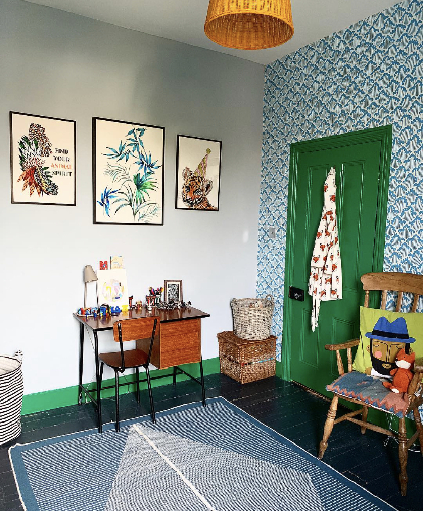
THE STUDIO
I am so lucky to have the largest and brightest room in the house as my studio.
I wanted to do something fun and creative in this space as it’s where I spend most of my time working from home on my business. I also wanted it to feel relevant to my work so I painted the ceiling in the same minty green that I use for my letter prints, which is pretty close to F&B Arsenic. I got the decorator to bring this down on to the walls as if there were a picture rail going around the room, a common detail in these period houses. Then below it the walls are painted in F&B Calamine, a gorgeous pale dusky pink. I carried both colours across the windows which looks really striking. I put in half cafe style shutter in a chalk pink, almost the exact same shade as the walls by Hillarys Blinds. My desk was my old Ikea one I bought for £25 on Gumtree. I sprayed the legs black and painted the top in Little Green’s mid Azure Green. My swivel chair and pendant light are from made.com
I really needed additional storage in here despite having the floor to ceiling wardrobes, but took my time to source the right pieces.
The bright orange filing cabinet houses my greeting cards and bought it from the wonderful family run business Blue Ticking. They are great for vintage kid’s furniture and storage solutions. Both the plan chest and wonderful old tall carpenter’s drawers complete with tool labels were from a favourite retro furniture shop to me in Forest Hill called Farr & Wyde.
I love my Mum Boss print in here it’s by my best friend I met at Art college in Dublin, Niamh Gillespie design.

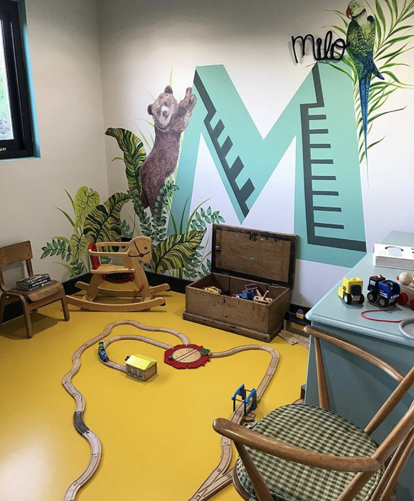
MILO’S BEDROOM
Another colour statement in this room, this time with the flooring. We went for a deep mustard yellow rubber flooring by the Colour Flooring Company. It’s fab and perfect for a kid’s room. It’s hard wearing, guaranteed for 10 years, super easy to clean and perfect for building train tracks!
I painted the M mural on the wall, which again is a play on my Letter Prints. It’s a really fun room and has a lovely church view. Three of my prints adorn one wall, the bear, Panda and Giraffe and a vintage tropical printed fabric, that I found on eBay and stretched on a frame, is on another. So, I guess it has a jungle/animal theme.


MASTER BEDROOM
I really wanted to create a boutique hotel vibe in here and make it feel like our own little sanctuary. A friend said it reminded him of a Parisian hotel room that he stayed in once so I guess I succeeded.
I worked very closely with the builders on the ensuite as I wanted to hide a wardrobe in there, not the most conventional idea, perhaps, but I wanted to keep the bedroom as streamlined as possible furniture-wise. I also wanted it to feel open plan so didn’t want a door and I put in an internal window so you can see straight through to the crittal-style shower enclosure, which we had made to order. This was probably the biggest splurge of the whole renovations but considerably cheaper than an entire crittal wall that I had originally wanted to separate the ensuite from the bedroom. The bucket sink is from Labour and Wait London and the brass hardware is from Bespoke Taps again.
I painted the room in F&B green smoke but I think I may go darker eventually, or at least paint the woodwork darker, but this colour works really well with the House of Hackney Babylon wallpaper behind our bed. The pine green velvet bed is from made.com, and the bedside tables and chest of drawers are from John Lewis and Partners. The lighting is from Spark and Bell an independent Brighton based Irish designer. I’ve used her lights a lot throughout the house as they are “on point” design-wise and are very good quality, but also reasonably priced.

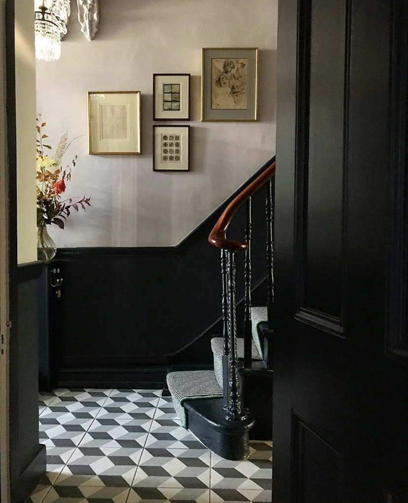
HALLWAY, STAIRS AND LANDINGS
When we first moved in we painted the hallway in Purbeck Stone and Ammonite, but this was always a temporary measure. We have now painted it in F&B Railings and Peignoir above the dado rail and I love it. The illusion tiles we put in a few years back and are from tons of tiles and the vintage chandelier was a 30th birthday present from Tom, probably one of his best, I still love it.
The black and white striped carpet and runner is from Carpetright UK.


KITCHEN REVAMP
We didn’t want to spend too much on this, as we may do a side return extension in a couple of years. But it was very tired and a leak in the ceiling for our old bathroom created a hole which was the final straw. Luckily my dad is a builder and he has done so much for us over the years including this kitchen. We kept the bones of the kitchen but changed the worktops and painted the cabinets and windows in Valspar, Under the Eaves, we took down 4 wall cabinets, tiled it and put up open shelving and two disk pendant lights. This really opened the whole room up and made it feel like a significantly different kitchen.
I also added brass door handles to the cabinets and brass sockets from Dowsing and Reynolds. We changed the sink and taps and added a new dining table from Made.com (again) and I bought the green velvet chairs from some friends who happen to be amazing interior designers. One wall is painted in Little Green Mid Azure Green and the rest are in F&B calamine. I think by using the same colour throughout the house it helps it flow more evenly, though the colour will have a different feel depending what it its paired with and how it’s used.
This is by no means my dream kitchen and I hate the floor tiles but I’m happy enough with this transformation for now.

DOUBLE RECEPTION ROOMS
These were the first two rooms we properly plastered and painted about 3.5 years ago but they need a refresh now. I still love the colour. It’s F&B (I told you I am their biggest fan) Hague Blue, so I think I will just paint it the same again. I painted the walls and woodwork in the same colour, which I think creates a really cosy dramatic effect. The sofas are from Made.com (also again) and Loaf Home and the standing lampshade is from House of Hackney, but the stand itself was £5 from a car boot sale.
I have some ideas for the second room here. It’s my next project. We want to change the radiator, maybe add an oversized floral wallpaper and create a reading nook by adding an armchair. I would also like to add some rugs to cosy it up.
We have a lot of original paintings in these rooms which we absolutely love, each of which tell a story.


The Girl with The Green Sofa