

Farrow and Ball New Paint Collection
Introducing New Paint Colours is not something that happens very often at Farrow and Ball, but I'm showcasing 9 new colours that they have just launched today. From an gorgeous exotic pink, to their deepest red, to a soft off white and beautiful blue, their nine new additions are blended with only the richest pigments and finest quality ingredients for an extra depth of colour, something Farrow and Ball are renowned for.
They take an extraordinary amount of care with each new colour, from refining its exact shade to coming up with the perfect name and telling the story behind each pigment. But it is not only introducing the new colours, they also have to decided which of their current colours to retire; since they keep a constant number of colours on their colour chart (132 to be exact).
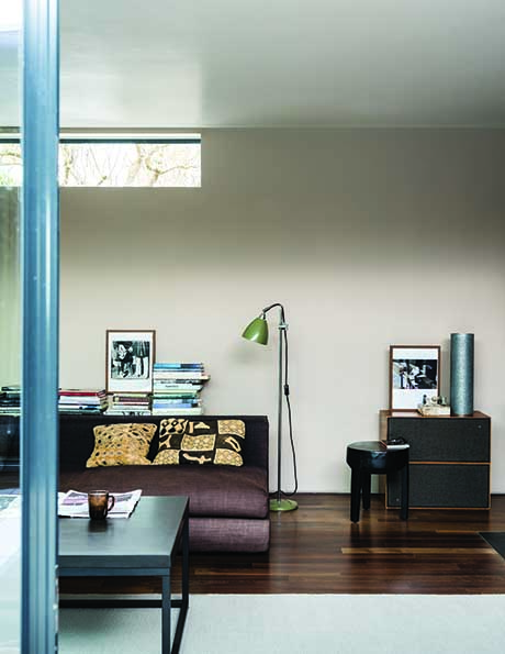
From subtle neutrals to inky blues, each paint shade is created with a blend of up to five pigments to create a depth of colour, which often changes with the light (I have Downpipe in my living room, which is grey, but which can look grey or blue depending on how the light catches it, and I’m always being asked what colour blue do I have in my living room!).
Still rooted in Dorset, England, its home since 1946, expert craftsmen combine traditional methods with contemporary technology. It’s also here that each roll of wallpaper is crafted with real Farrow & Ball paint.
CHARLOTTE COSBY – HEAD OF CREATIVE
“New colours is an incredibly exciting time at Farrow & Ball. It’s not something we do often, making it feel really special.”
“Our colour names are never invented on a whim. Each story is meticulously researched, as was the case with down to earth De Nimes. Inspired by the colour of workwear first woven in the southern French city of Nimes, denim was once the uniform of the textile factory worker but is now loved across the globe.”
“Each of our colours has a complementary white which will balance your chosen shade, giving a more considered feel for example the sober tones of Bancha sit perfectly with the grey nuances of Shaded White.”
So, read on to find out more about the nine new colours in the range before I give my views on the collection at the end of this post.

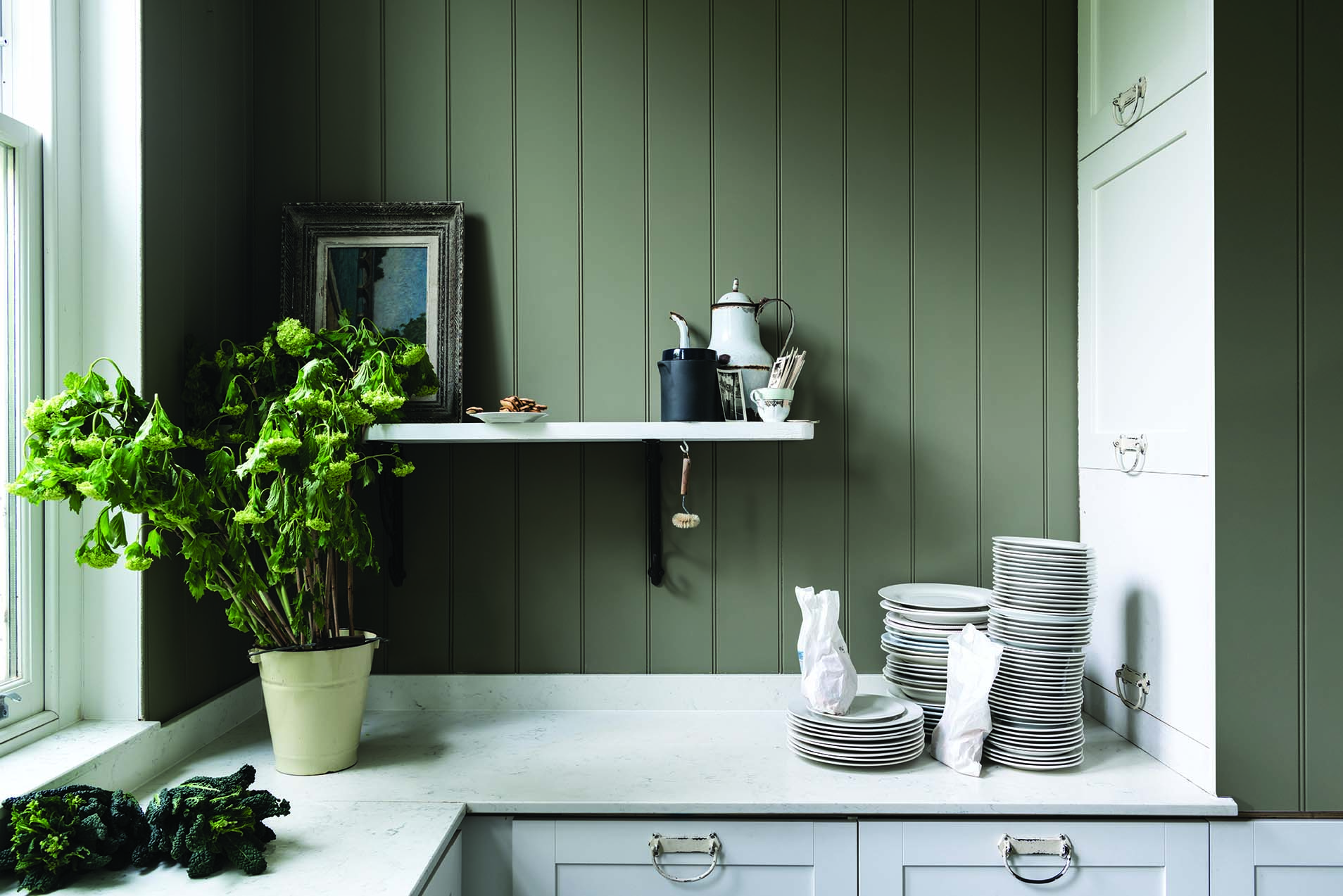
Bancha Paint Colour
BANCHA No.298
A protective olive green
This mid-century modern green is a darker version of the much loved archive colour, Olive. Perfect for those who want to embrace stronger colour in the home, its sober tone creates rooms that feel calm and serene - especially when combined with soft pinks and browns. Named after Japanese tea leaves, Bancha, like a cup of green tea, provides a feeling of security.
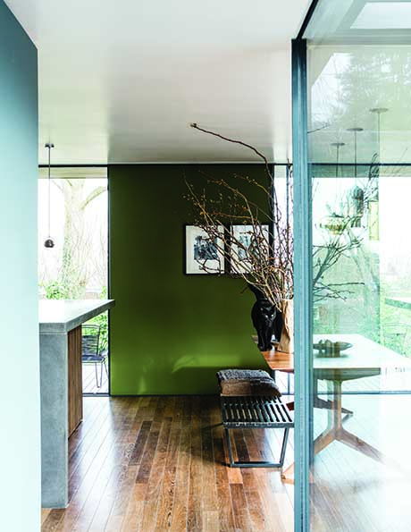
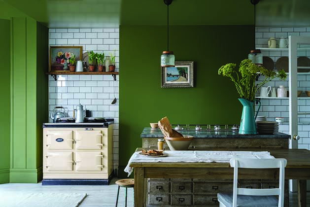


Bancha, De Nimes and Jitney Paint Colours

De Nimes Paint Colour
DE NIMES No.299
A down to earth and grounding blue
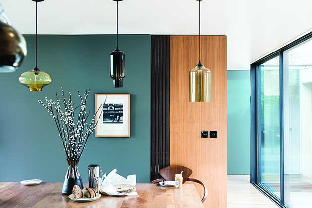
This quietly elegant blue feels wonderfully down to earth, so could be used on anything from a kitchen island to an airy drawing room. The exact shade is rooted in a regency palette but is inspired by the cloth of everyday workwear made in the French city Nîmes. Like denim, its blue hue is ultimately fashionable and yet always feels grounded.

Jitney Paint Colour
JITNEY No.293
A relaxed brown based neutral
This earthy colour sits somewhere between the more traditional Oxford Stone and greyer Elephant’s Breath. Though muted, it is incredibly uplifting and reminds Farrow and Ball of lazy days by the sea – hence sharing its name with the bus that whisks NewYorkers out of the hot city to the similarly coloured sandy beaches of the Hamptons.
JOA STUDHOLME – COLOUR CURATOR
“We didn’t set out to create a palette of nine, but you can imagine our joy when we put our new colours together and discovered how beautifully they sit side by side.”
“When we create new colours they tend to fall into three very broad brackets. The first is trend-led colours that feel relevant and will nourish the contemporary home, Jitney is a wonderful example of this, with brown based tones that mark the move away from cooler greys. Second is existing shades that might need a very slight tweak for today’s market – Smoked Trout and Sulking Room Pink is a recent examples of this. And finally some of our most popular hues just beg to have lighter or darker accents such as School House White which is the lightest colour in the contemporary neutral group.”
“The creation of our colours starts in a really simple way – at a kitchen table with paint filled ramekins which are constantly mixed and remixed for weeks.”

Paean Black Paint Colour
PAEAN BLACK No.294
A chic red based black
This Georgian inspired red based black creates an intimate feel in super contemporary or bohemian homes, while adding a distinguished look to traditional exteriors.The perfect accent for all Farrow and Ball reds and completing their range of blacks, Paean Black conjures up the shade of old leather hymnals and so is named after a song of praise.


Preference Room Red Paint Colour
PREFERENCE RED No.297
A deep, rich red
The deepest and richest of Farrow and Ball reds, this Baroque colour is named in honor of their original trade name, Preference Paints. It can be used with any of the Red Based Neutrals but is particularly striking when seen in combination with Paean Black and Sulking Room Pink.

Ragwali Paint Colour
RANGWALI No.296
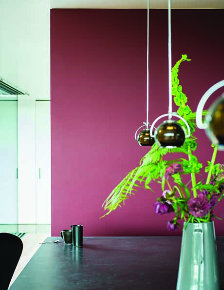
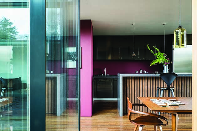
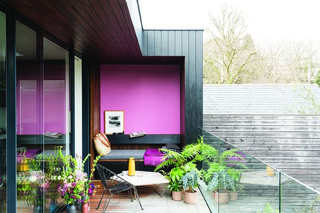
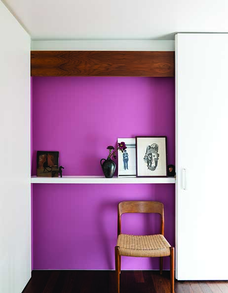
An exotic and adventurous pink
This colour is exotic, happy and vital. The most adventurous of Farrow and Ball pinks, Rangwali is incredibly friendly and takes its name from the powder which is thrown so enthusiastically during the Holi festival of colours in India. Though bright, it has an absorbing depth of colour which is achieved by adding a small dose of black pigment.

School House White Paint COlour
SCHOOL HOUSE WHITE No.291
A soft off white
This is the lightest colour in the group including Shadow White, Shaded White and Drop Cloth - each created to look like white when used in deep shade. Pared back, timeless and familiar without the cool undertones of the more contemporary neutral groups, this soft off white is reminiscent of the colour used in old school houses.


Sulking Room Pink Paint Colour
SULKING ROOM PINK No.295
A romantic and muted rose
Not to be seen as overtly pink, but rather a muted rose with enormous warmth, its powdery feel makes it incredibly soft and easy to use with complementary tones. Sulking Room Pink is evocative of the colours so often used in boudoirs, a room named after the French ‘bouder’ - to sulk.
GARETH HAYFIELD – HEAD OF RESEARCH & TECHNICAL
“Our team of chemists work hard to create our distinctive paints and colours, combining quality ingredients and rich pigments to give our colours a unique depth and long lasting finish.”
“Integral to our paint is the high levels of pigments, including titanium dioxide; a bright white pigment that gives each colour its exceptional durability and coverage.”
“The complex blend of up to five pigments, which are sourced from Europe, China and India, not only give the superb depth of colour but also mean our paint responds to all types of light.”
“We rigorously test each colour in every finish and in varying light conditions until we are happy with the exact formulation and pigment levels throughout.”

Teron Paint Colour
TRERON No.292
A dark grey green
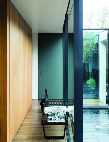
This enduring colour is a dark green version of Farrow & Ball classic Pigeon, hence being named after the green variety of the same species. Although traditional in feel, Treron is perfect for modern homes where lots of natural materials are used or as an accent for both French Gray and Traditional Neutrals.
Colour is deeply personal to each and every one of us. Deep Red Walls may be one person's dream and another person's horror, but that's okay because you should always decorate your home for you.
With 132 shades to choose from, Farrow and Ball have been a long standing favourite of mine, and at some point in time, I have probably used a colour from every single shade on their colour chart, excepting red (that is a colour I personally cannot live with).
I wrote a few weeks ago about how I thought Pink (the new neutral), would move towards a deeper hue, so seeing Sulking Room Pink in here, means this collection is bang on trend. This colour is actually my personal favourite in the collection, fabulous in a bedroom, perhaps with burgundy, which we are seeing coming in for Autumn, or a deep brown, using something like an ochre colour in accessories, or an ochre velvet chair or bed, but I'd also consider using it in a dining room, alongside green and terracotta (in fact that has just given me an idea for an update!).
I'm also drawn to Jitney and Bancha. Bancha, somewhat predictably, given green is one of my favourite colours. I particularly like the softness of this shade, which would be calming in any room. Those of you who regularly tune in will know, the feeling of a room, especially a calm room, is very important to me, to be able to relax.
Jitney, is a lovely neutral (and we are seeing a lot of neutral tans and beiges coming back to replace the neutral of the last few years; grey), which would sit against a deep brown and terracotta or peach. These typically take a few years to filter down to you and I (I’ve just used pink for the first time and how long has it been the trendy colour?!), but I think beige neutrals will make a comeback.
So, that's just my point of view, surprisingly for me I’ve been drawn to a rose pink and neutral, Jitney, whereas I’ve always been a self-confessed dark colour lover. What does that say, I wonder?
Actually, what I am realising, is that I love colour, I’ve had a light home, I’ve had a dark home, but it has always been a colourful home and what I have realised recently is that dark rooms are create for that cosy evening feeling, but actually some rooms in my house need to be lighter.
I’d love to hear your thoughts on the collection in the comments below.

The Girl with The Green Sofa


