The Beige Blues, Colourful, Maximalist, Flamboyant Home
Tonight’s home tour is a masterpiece in more is more decor. Welcome to Michelle from The Beige Blues who uses her interior as chosen therapy. I’ve talked about this myself; how I decorate and “faff” as a stress relief, I think many of you who follow me do too. A stately Queen Anne Redbrick makes this a fairy tale house with plenty of rooms to indulge Michelle’s love of colour and decorating. read on to find out more.
My name is Michelle Carder. I am a recovering insurance lawyer and breast cancer survivor. Explosive colour, the compulsive painting (and re-painting) of every square inch of our house, and decorative floofing, futzing and faffing with exuberant flourish are my chosen therapies. My husband is Mike Ochs. Mike has a gifted mechanical mind and has built everything from kitchens and computers to component parts for the space shuttle. I lack such gifts and therefore exploit his talents on a regular basis in the DIY restoration and remodel of our beautiful, crumbling Queen Anne located in a small Northern Michigan (U.S.) town called Cadillac.
In April 2017, I decided to follow the white rabbit and started a blog called “The Beige Blues”. The Beige Blues is, more or less, a comedic and profanity-filled anthology of true-life Artamène ou le Grand Cyrus-length stories explaining what took me from fear of colour to colour fearlessness. It is an unorthodox approach to blogging for sure, but I love humour and storytelling, and life is about love and laughter.
I have no background or training in interior design, architecture, or anything relevant to the creation of an interior space. In fact, I have no idea what I’m doing, but that’s half the reason the blog is funny.
Our Home My muse is our stately red brick Queen Anne which, with its wonky shapes and crooked walls, Rapunzel fairy tale turret, melting rear exterior wall, perpetual floods, dodgy wiring, and bats in the belfry (literally) makes for great storytelling. The house (which totals about 5,000 square feet if you include the basement and vast unfinished attic) was built circa 1902 by Charles E. Russell as a replication of his childhood home in England. It was constructed during Cadillac’s lumber baron era, so the woodwork, which is well-preserved, is remarkable.
Sadly, however, the house fell into terrible disrepair several times during the last century. We bought it in 2016 for $95,000 from an investment group after it sat on the market for four years because everyone thought it was falling down. We disagreed with the masses and decided to take the risk. Now we’re doing everything from the inside out, focusing first on the interior spaces, which is where we spend most of our time due to Cadillac’s Antarctic-style winters, which seem to last about nine months.
Mike and I live here along with our dog and frequent Instagram pooch prop, Levi a.k.a. “Bees.” It’s a lot of house for two people and one small dog, AND IT’S STILL NOT ENOUGH!
Style and Inspiration My (and therefore our) decorating style is theatric and eclectic. I love blazing blasts of colour and am emphatically opposed to “accent walls.” Our walls are swathed from floor onto ceiling in unapologetic oranges, pinks, blues, purples, reds, and, of course, black. If we haven’t installed gold or black tin on the ceilings, we’ve painted them metallic gold. Trim is painted with metallic and pearlized paints, and liquid leaf gold paint can be found everywhere, including the floors.
When I do things right, colour is my main inspiration. I’ll see a colour combination – on random objects, in magazines, nature, books, etc. and whatever – that I can’t get out of my head or heart. Then I want it on the walls and everywhere else. Secondary to colour is everything else. Movie sets, fairy tales, even music help me conjure rooms that make people happy. My newest source of inspiration is Chloe Barcelou’s website, which is a photographic feast for the eyes.
The Rooms

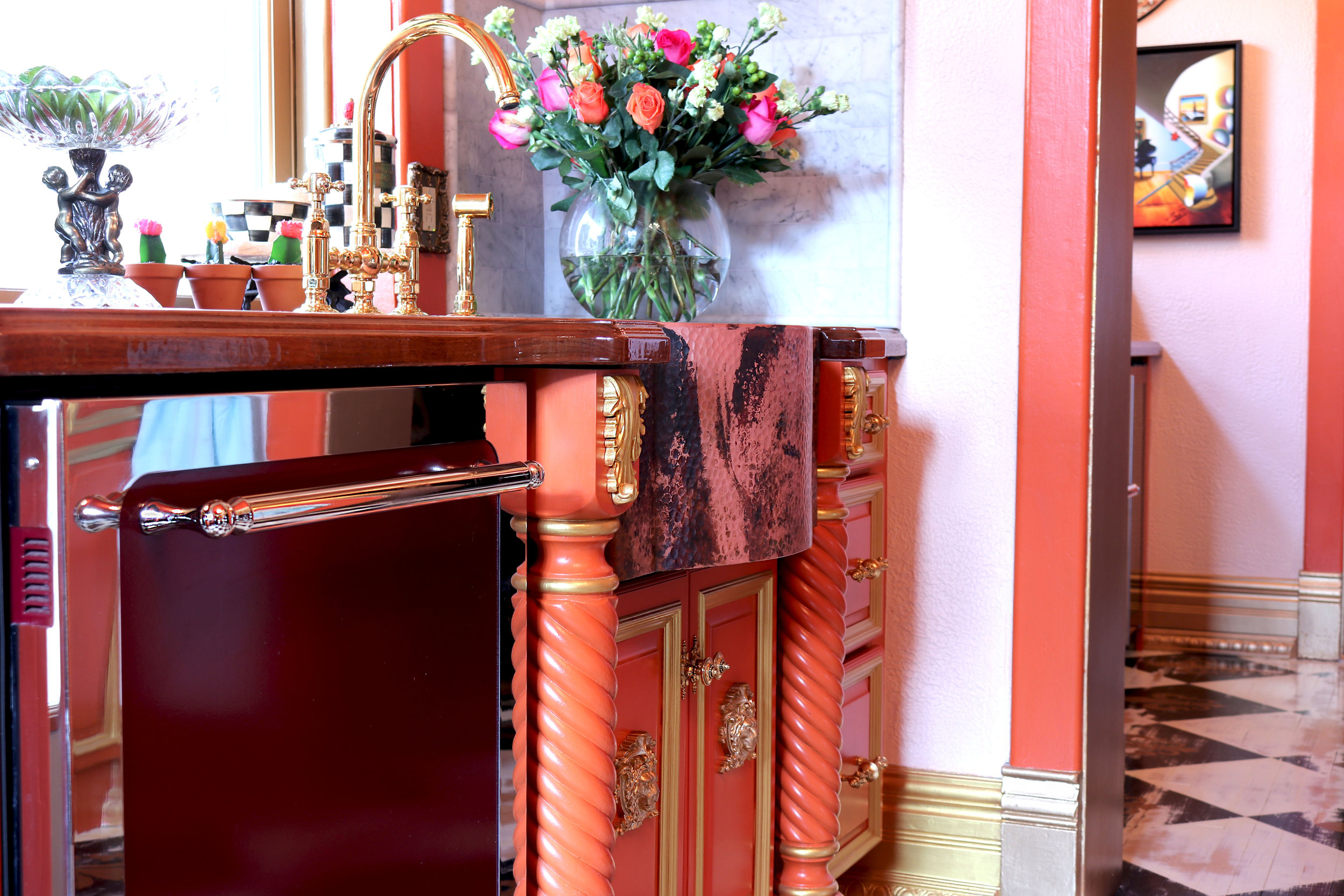
So far, our work on this house has been 100% DIY. We haven’t finished yet, but we’re well on our way. Our “complete gut and rebuild” DIY kitchen was a five-month plan that evolved into a two-year project. Our process for creating this space was completely unplanned and backwards. We bought cranberry red Aga Heartland appliances while we were living over 2,000 miles away because it was a killer eBay deal. The appliance colour proved to be the chief challenge for the space, causing us (me) to lose our minds and buy gallons and gallons of ill-fated purple, black, yellow, and even fuchsia paint.

A few months into the project, we decided we wanted the kitchen to have hints or undercurrents of an old Victorian kitchen with free-standing wood furniture. But we didn’t actually want “furniture” in the kitchen, so Mike built a faux hutch on one wall and a pantry resembling an armoire on another. We also installed wide-plank walnut counters and finished them with high gloss polyurethane.
Colour choice in this space was hotly contested. Mike wanted black cabinets and maybe a celery green on the walls. I wanted bright, punchy colours. After I experimented with no less than 40 different colours for walls and cabinets, Mike finally threw in the white towel. Yes!!! Because I had my eye on MacKenzie-Childs’ Sunburst Nosegay which I had purchased on clearance. It’s pink and orange and cranberry and black and white and oh my!!! The colours in this tiny faux arrangement are MAGNIFICENT HAPPINESS.
To recreate the nosegay on largish scale, I went with Farrow and Ball’s Pink Ground on the walls, Charlotte’s Lock on the trim, and Modern Masters Pharaoh’s Gold as an accent on the appliqués, accents, and ornamentation. The only deviation from the MacKenzie-Childs’ inspiration was light blue/green on the ceiling and doors. Originally, I was going to paint these spots bright yellow. However, I used a greenish/bluish-tinted primer in these areas and both Mike and I loved how this tone interplayed with the other colours. Thus, we segued and chose Benjamin Moore’s Tranquillity as a third (okay fourth) accent colour.
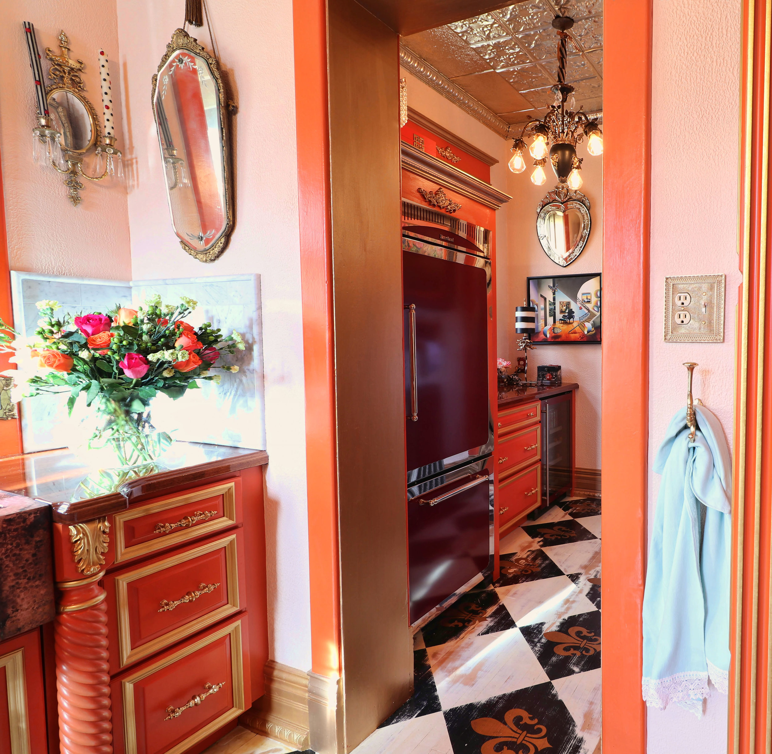
I also hand painted the original beech floors then distressed them and stencilled fleur-de-lis on each of the black squares. This took more than two weeks and was not the original plan. We wanted a traditional looking high contrast and glossy black and white checkerboard floor, but we totally blew the polyurethane pour and had to go to Plan B on the fly.
Now that the kitchen is done, I can safely say we love it. The combination of pink and orange is pure shapeshifting magic and feels exactly like a pink sunshine ocean sunset. Add in black and white checkerboard floors, and you really do start looking for white rabbits.
The kitchen actually is capable of producing an emotional response. Not because of the design (or the food). Because of the colours.
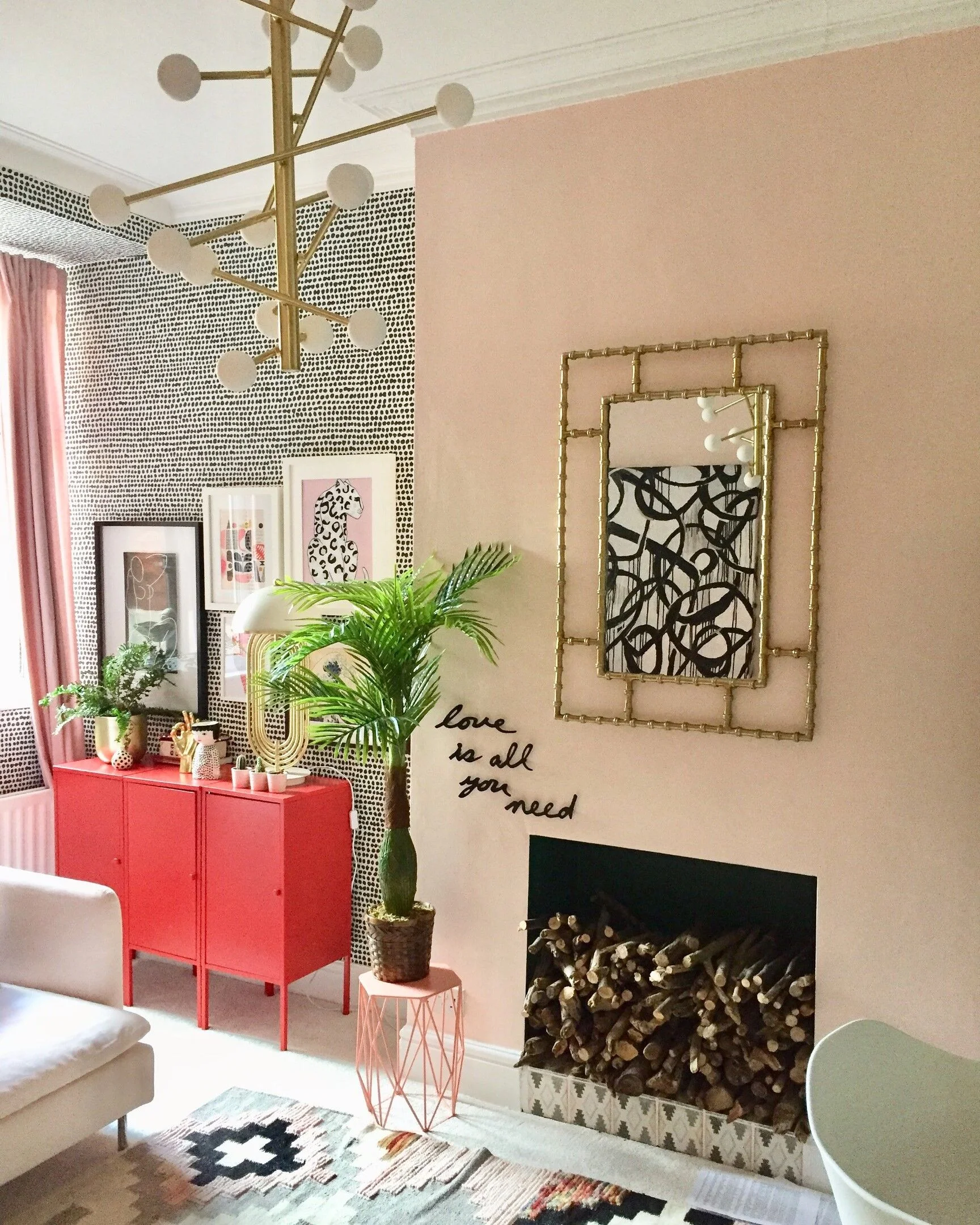
The Study/Home Office.

This is a fabulously quirky room, mostly because of its shape. It was light blue when we bought the house and I promised Mike I wouldn’t repaint “just this one room.” That changed after I discovered Farrow and Ball’s Middleton Pink and put a sample splotch on the wall. In the southeast light this space catches, the colour was too magnificent to resist. It almost made me cry. So up it went.
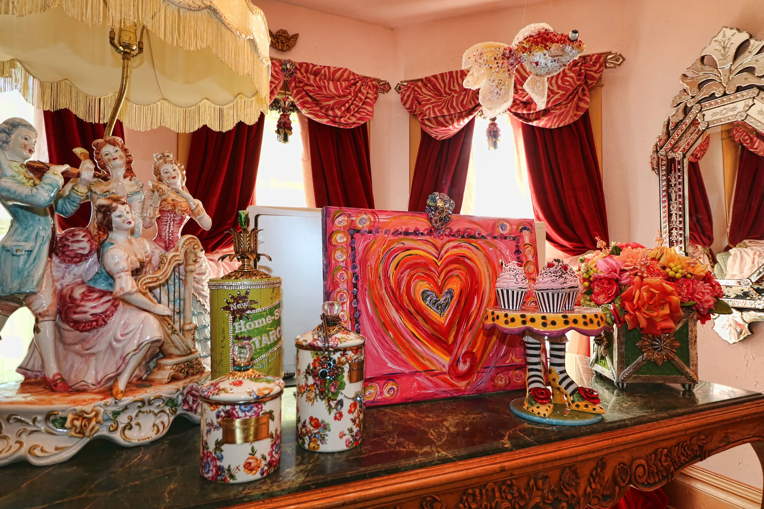
I tried numerous combinations with the pink, including another shade of pink (think ethereal cloud pouf pinky pink room), rust (which was lovely), but finally landed on theatre-curtain-red for the drapery. Wow. The colour combo makes me think of strawberries and cream, and the most decadent desserts, which is why my desk is host to a wacky witch’s feet cake plate and faux pink cupcakes. Probably a bad trigger for dieting, but at this point, I just don’t care. The colours make my heart sing.
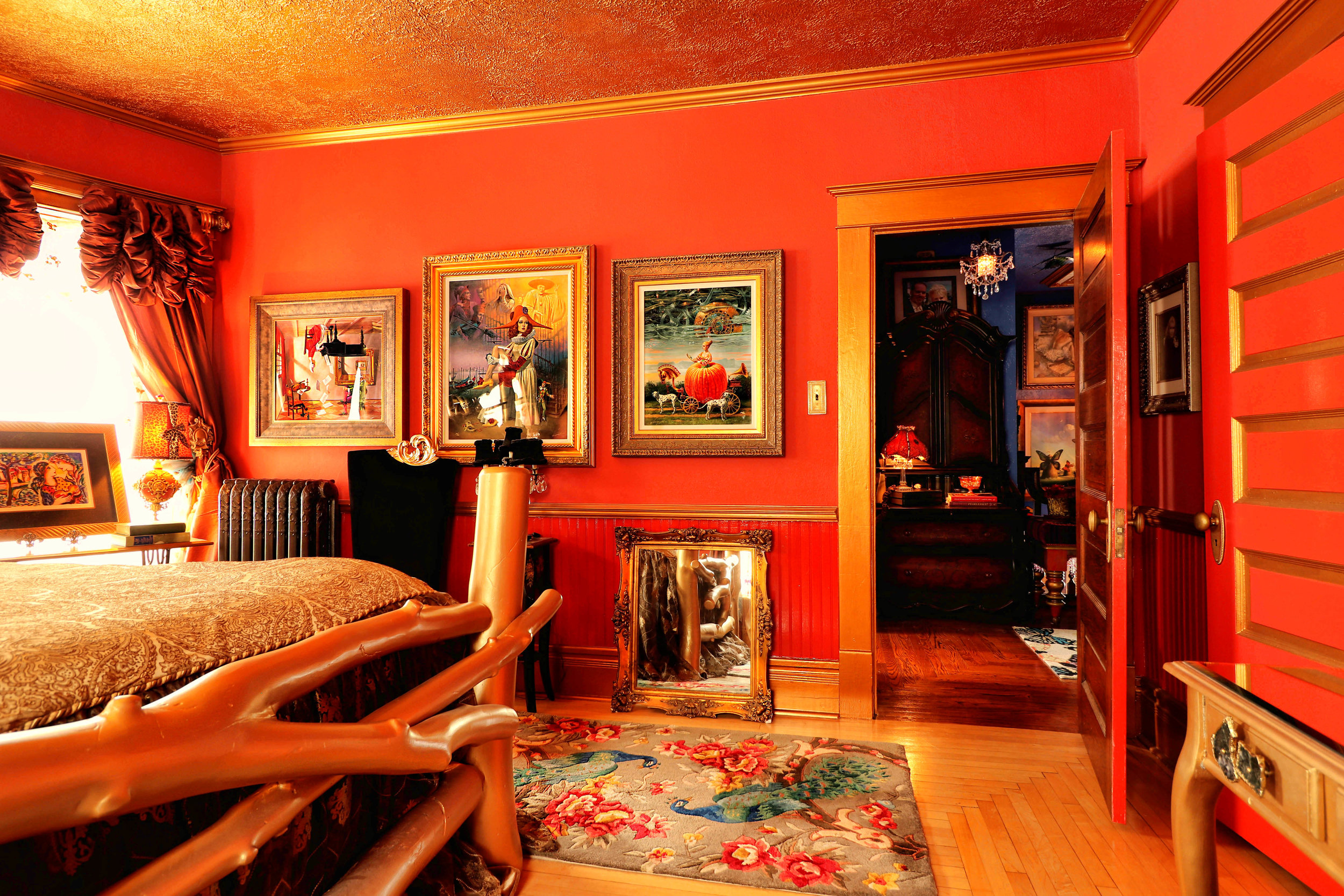
The Master Bedroom
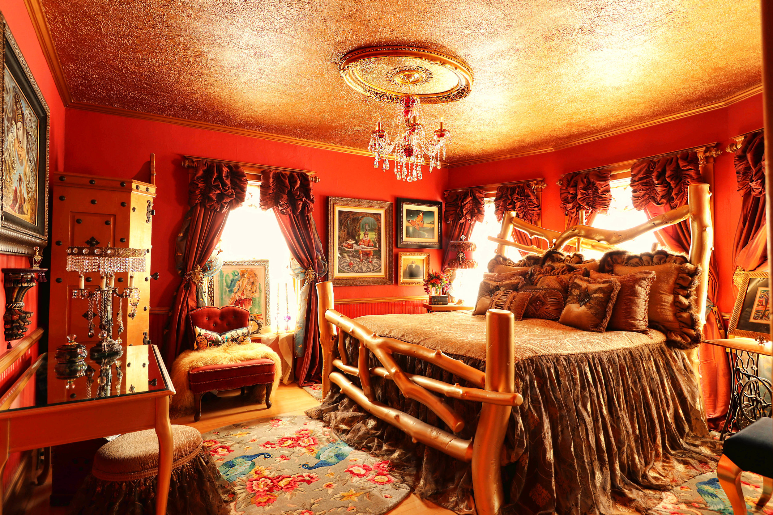
I repainted this room twice (story on my website, The Re-Re-Decoration of a Bedroom: From Boring to Blazing). The lesson I learned is this. No matter how much you love your spouse, if you are the alpha in the décor arena, DO NOT COMPROMISE on paint colour for walls or furniture.
Here, finally, the walls are Farrow and Ball’s Blazer, an amazing rusty red vermillion that looks positively luxurious with teal and gold accents. The furniture, trim, and ceiling are painted with Modern Master’s Tequila Gold (¡Arriba, Arriba!). Initially, Mike vigorously opposed the red. But after the paint went up and the room pulled together, he admitted it is his favourite room in the house. The colours are so immersive they actually can be construed as serene.
The Hallway and Staircase

Our entry hall, staircase, and upper hall are painted brilliant Lapis Lazuli (Behr paint). I chose this colour because the natural light in these areas is fickle, tending towards dark and shadowy, and I thought the bright, punchy blue would take things up a notch. Which it did. However, Home Depot was out of the matte finish and I was too impatient to wait. Plus, I wanted to take advantage of the Fourth of July Red, White and Blue Sale. So, we bought 5 gallons of this screaming blue in semi-gloss. I do not love the gloss, so I will be repainting all of this in the not so distant future in a different colour and finish.
The art makes a big statement in our Stairway to Heaven, and all around our house. In the staircase, the artists are Stanaslav Sugintas, Michael Cheval, and Vladimir Kush. All three painters tend towards the surreal and absurdist styles and we unabatedly love their works.
The Den

Our den is the home’s original dining room. It has stunning, dark-stained oak wainscoting that shoots more than halfway up the walls. We therefore wanted to spend as much time in the room as possible, so we commandeered it as a television room/den. The walls are painted a colour called Raging Bull by Behr (Toro! Toro!), which gives the space a wonderful, small theatre feel.
Currently, we are in the process of turning this room into a steampunk fantasy. Mike has built a steampunk art light on one wall and is gearing up (pun intended) to extend this clunky contraption around the room. The expansive light fixture will bob and weave through various steampunk artifacts, twisting and turning around the art to provide accent lighting as well as a magical neo-Victorian mystery vibe that should make this the most fun room in the house. To date.
The Guest Room

This is another room I repainted twice (website story is The Re-Redecoration of a Guest Bedroom: From Dark and Disturbing to . . . Squirrel!!!). The wall colour is Farrow and Ball’s St. Giles Blue, which the company advertises as a “striking blue hue” that “cannot fail to make you smile and will hold its own even in the darkest of places[.]” True that. I smile every time I walk into this room, or even past it on the way down the hall.
I paired the blue with high contrast red, and black and white with metallic gold accents (because I was, at the time, seriously crushing on teal blue and red). All of the furniture is hand painted by me with gold liquid leaf and metallics (Modern Masters Metallics in Sashay Red and Sapphire and Benjamin Moore Molten Metallic in Gold). The slightly circus-like atmosphere of the room makes it an entertaining escape for our guests.
The large mid-century abstract hanging over the dresser enhances the eclectic feel of the space and is a personal treasure. My grandmother painted it back in the late 1950’s.
The Turret Room

This tiny room off the entry hall is in the cupola (turret room). The star attraction is the giant red leather and black gloss throne, which previously sat in my Southern California law office. Of course, that office was 400 square feet and this one is barely 9 x 9, but we discovered that large scale furniture in a small room works if the colours are right. Because the walls here are black, they recede, and because the walls recede, we can get away with big statement pieces in a small space.
The Parlour/Dining Room

Our parlour currently serves parlour purposes, plus it is our temporary dining space. This essentially was my first decorating project in the house and the process is described on my website in the post entitled, having a Boo Radley Moment, Are We? We painted the room with Benjamin Moore’s Aplomb, or “compromise purple” as I call it, because this colour was not my first choice. It was, however, a colour both Mike and I could agree upon, as were the black, red, and gold on the pocket door and the black tin ceiling which Mike and his brother installed.

Currently, I’m exploring other colour options to change the mood of this room into something more akin to a dramatic secret underground cocktail lounge experience.
The colour-crazed dining table belonged to my great, great grandparents. Much to my mother’s horror, I’ve painted it no less than five times. I even painted the toenails on the lion’s feet with sparkly red glitter varnish. The two large, dreamy paintings over the banquette are by Stanaslav Sugintas (with the semi-nude lady on the zebra being the BIGGEST CROWDPLEASER IN THE HOUSE).
The crackly colourful banquette reportedly is from eastern Europe, circa late 1800’s.
The Powder Room

In connection with the kitchen remodel, we also ripped out a very horrible adjacent bathroom with an eye towards turning it into a luxurious powder room. The initial plan was to paint the room white and install Carrara marble floors and wainscoting. However, the walls and ceiling were in pitiful condition and we wanted a shortcut solution, which included covering the walls with panelling and the ceiling with gold tin. We painted the walls Timeless Ruby (Behr) with contrasting black and metallic gold on the trim and door.
Now the room feels like a pre-Bolshevik Russian jewel box and we love it.

***
There still is so much to do in this house! On the docket is a rear sunroom addition which will serve as a dining room and, the project which makes me most happy, the conversion of our amazing unfinished attic into a master bedroom suite. Best part of that? Mike is building me a NANCY DREW MEETS CHRONICLES OF NARNIA INSPIRED HIDDEN STAIRCASE PORTAL into said master suite. He’s already designed it.
The game is afoot!

The Girl with The Green Sofa