

Posterlounge-Choosing Art for Your Home
ART. It is so personal, or if you get it right in your home it should be.
Pictures you love, pictures that speak to you. Perhaps pictures of your family, or a place you have visited, or something that you have seen in a shop, or on Pinterest or Instagram that you knew you just had to have, or a mix of all.
But how do you go about choosing art for your home?
Because while you should choose items you love, if you throw a mix of everything together perhaps it feels wrong, or the colours clash, or they clash with your wallpaper, or the items you already have.
It is very rare to start collecting art from scratch so I teamed up with Posterlounge, a German based company to show how I chose art for my home. It wasn’t an easy choice, Posterlounge sell 1000s of prints in all different styles; landscapes, food and drink, portraits, architecture, botany, vintage, I could go on….
I knew that I was looking for art for my newly decorated bedroom, so I started there.

Having recently changed the colour of my bedroom to a dusky pink and with the addition of my favourite House of Hackney wallpaper, the art I originally had in here wasn’t working with the colour scheme. So I chose art that would, by choosing art that had an element of my colour scheme in it. In the photo of the fireplace above, you will see a canvas (“Flower Pattern XI”) which has a pink floral pattern on the t-shirt of the lady. It is a simple yet striking portrait and its simplicity sits well against the bold, floral wallpaper.
To the bottom right (of the fireplace image) you will see another print in similar tonal colours. “Get Lost” has a playful feel to it and once again the colours work with my wallpaper. I added a print I already owned above the fireplace, but kept it to a similar theme- portraits. This print has a hint of yellow which brings the colour of my bed to the fireplace wall, and also picks up on the yellow in the wallpaper.
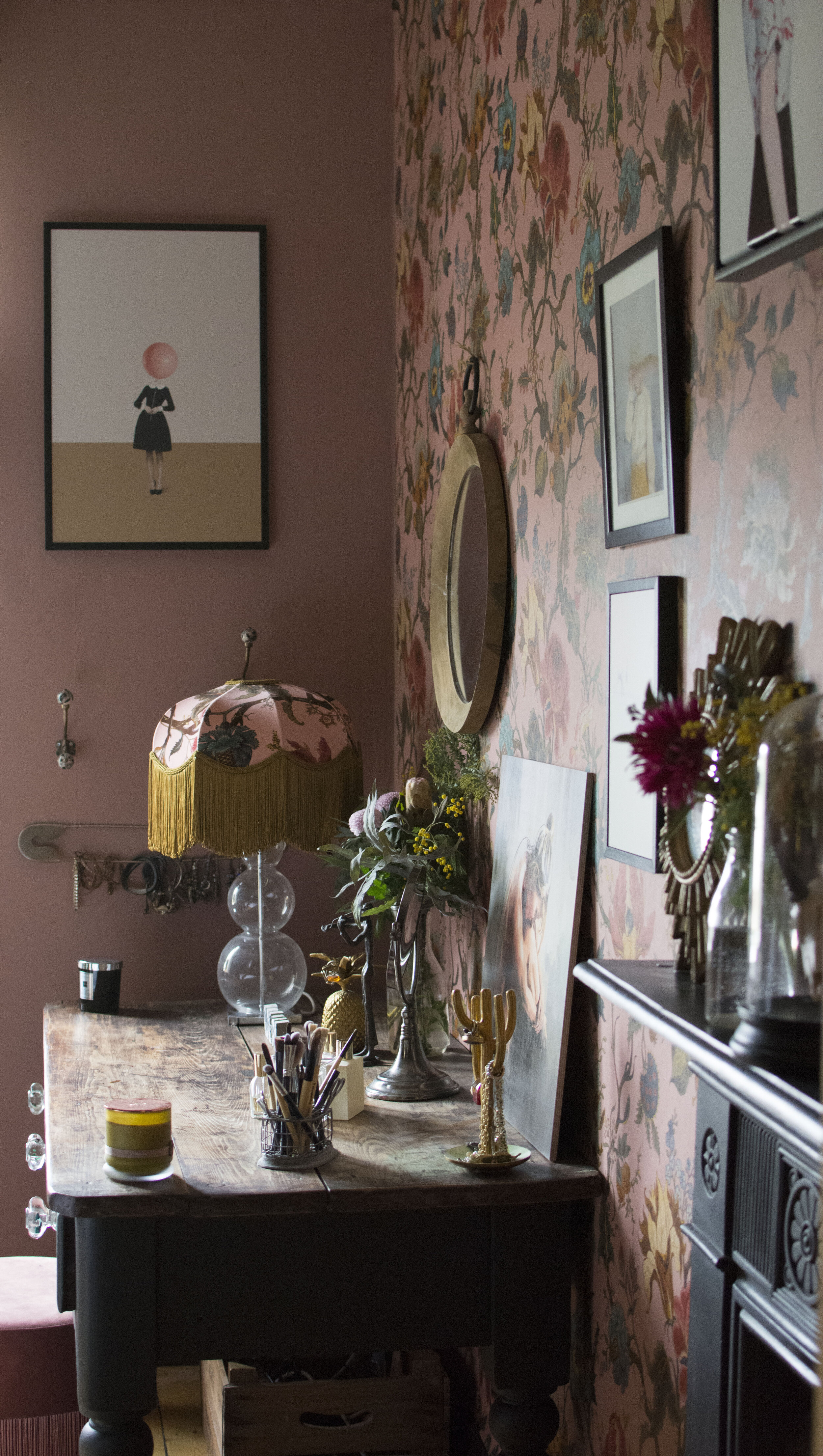
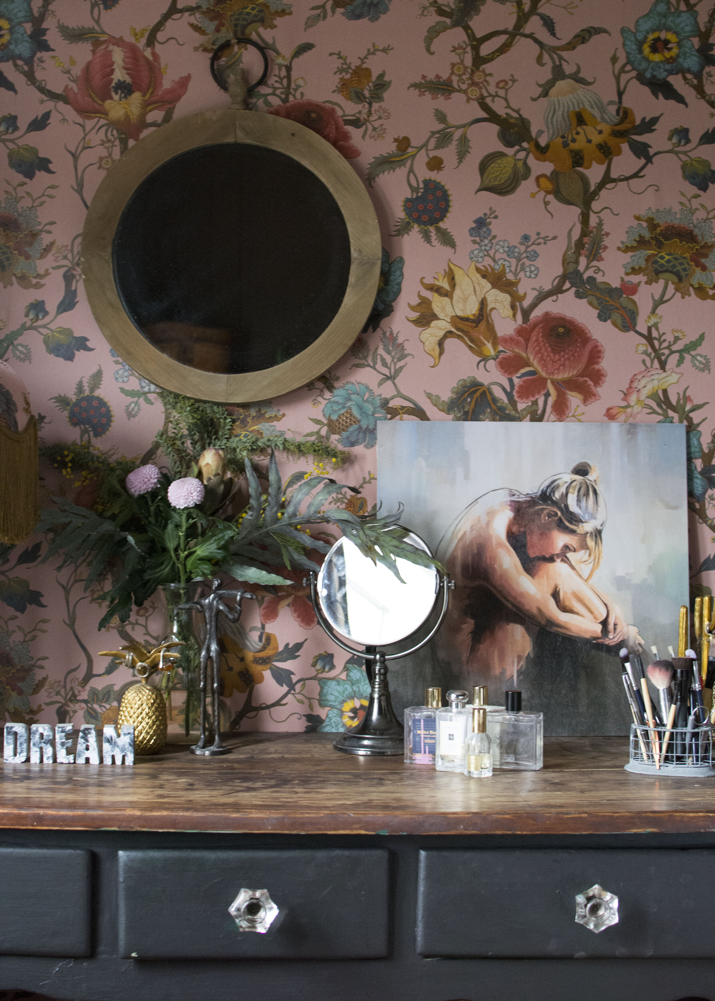
To the left of my dressing table (below) you will see a print by the same artist as “Get Lost” , called “Obvious Imperfections.” Again, it’s a portrait style image and the background tones work well in this room, but I also liked the playful balloon head which brings a pop of pink that also happens to also be almost the perfect colour to match my wallpaper. The image appealed to my humour, the fact it worked colourwise in this room was an added bonus.

On my dressing table (below), I chose an image called “A Decision” printed on wood. The tones in this image pick up the colours of my dressing table but it was the “rawness” of this image that spoke to me, one of two from this series I chose.
You will already see that I have chosen a mix of playful and serious art and mixed them together. The key has being finding colour within the art that work with my scheme.


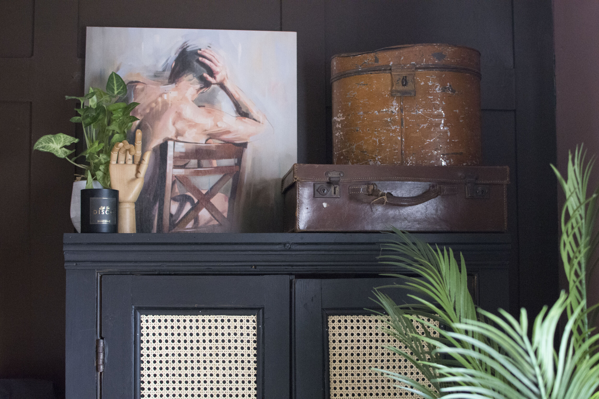
Here is the other image from this series of prints “Structural Form”. I could easily have chosen all of the images in this series, but I chose this one a) because I love the art and b) because the brown tones of the chair fit well with my brown panelling on my wall, and the grey/black tones against my up-cycled cupboard.
By now, you are probably getting a sense of how I choose art- not only because it appeals to me but based on whether the colours in the image will fit with my room decor. Well….

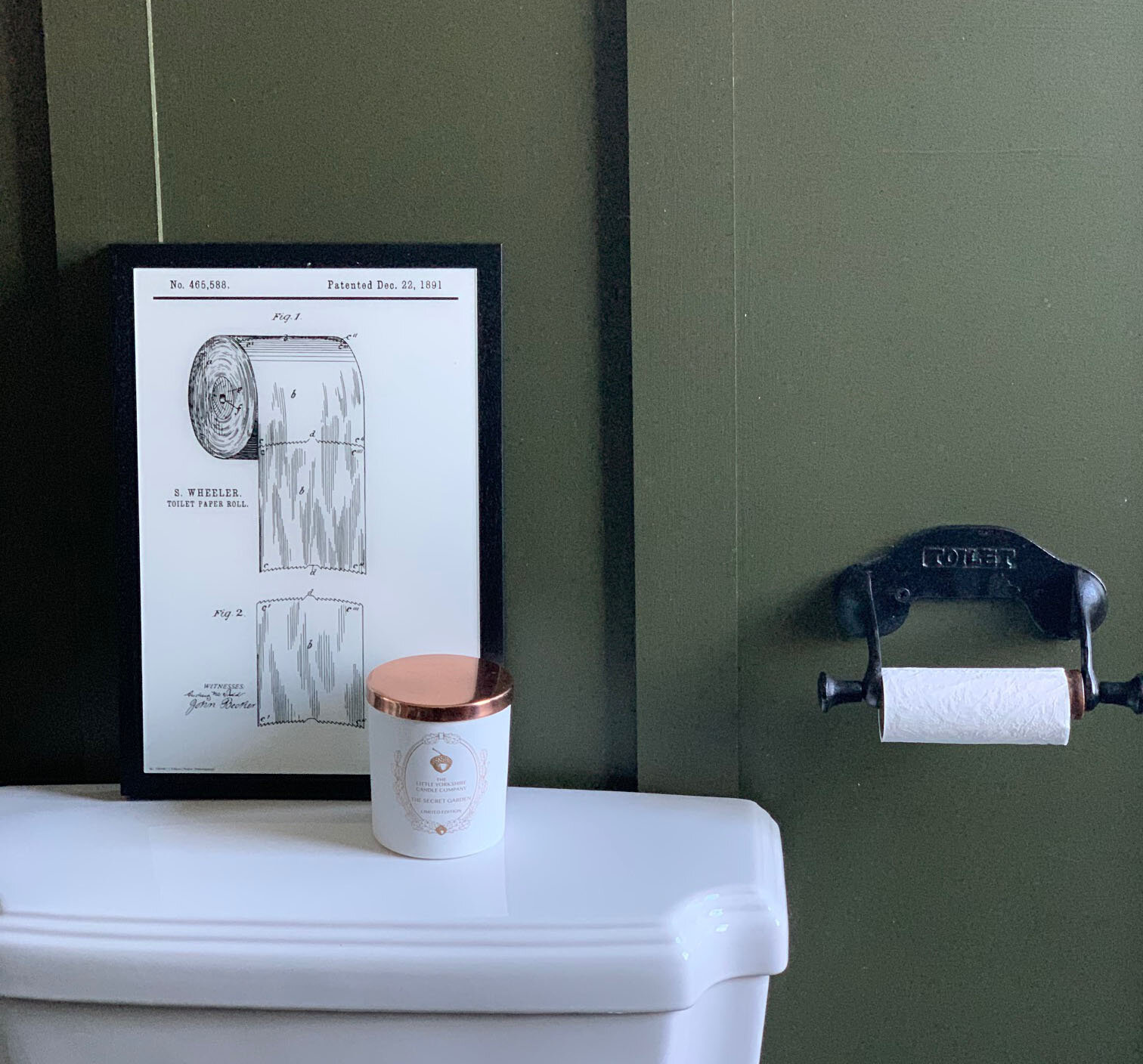
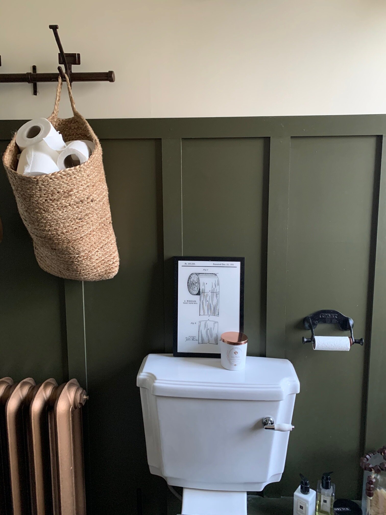
……..this art I chose purely because it appealed to me. Granted, it is entirely neutral so would fit in any room scheme but I chose it for my bathroom because it is a vintage print of the patent for toilet roll. For those of you who know nothing about my day job, I spend a lot of my time working with intellectual property, including patents and so when I saw this print it was like having a little bit of my job as a piece of art.


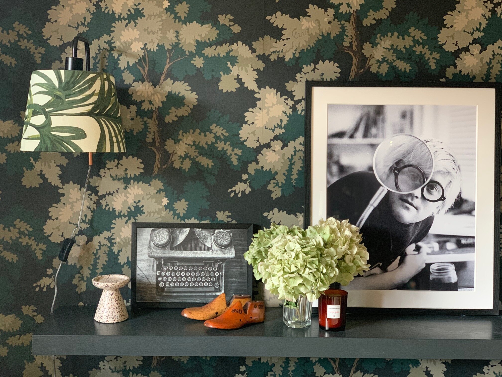
Continuing the vintage theme, I chose this print of a vintage typewriter for my living room. While I often tend towards portrait art, I’m also particularly fond of black and white photography and this image fits the bill. It also sits perfectly alongside a print I already own and is neutral so I can move it from room to room, should I chose to switch things around at a later point in time. Something I do quite often.

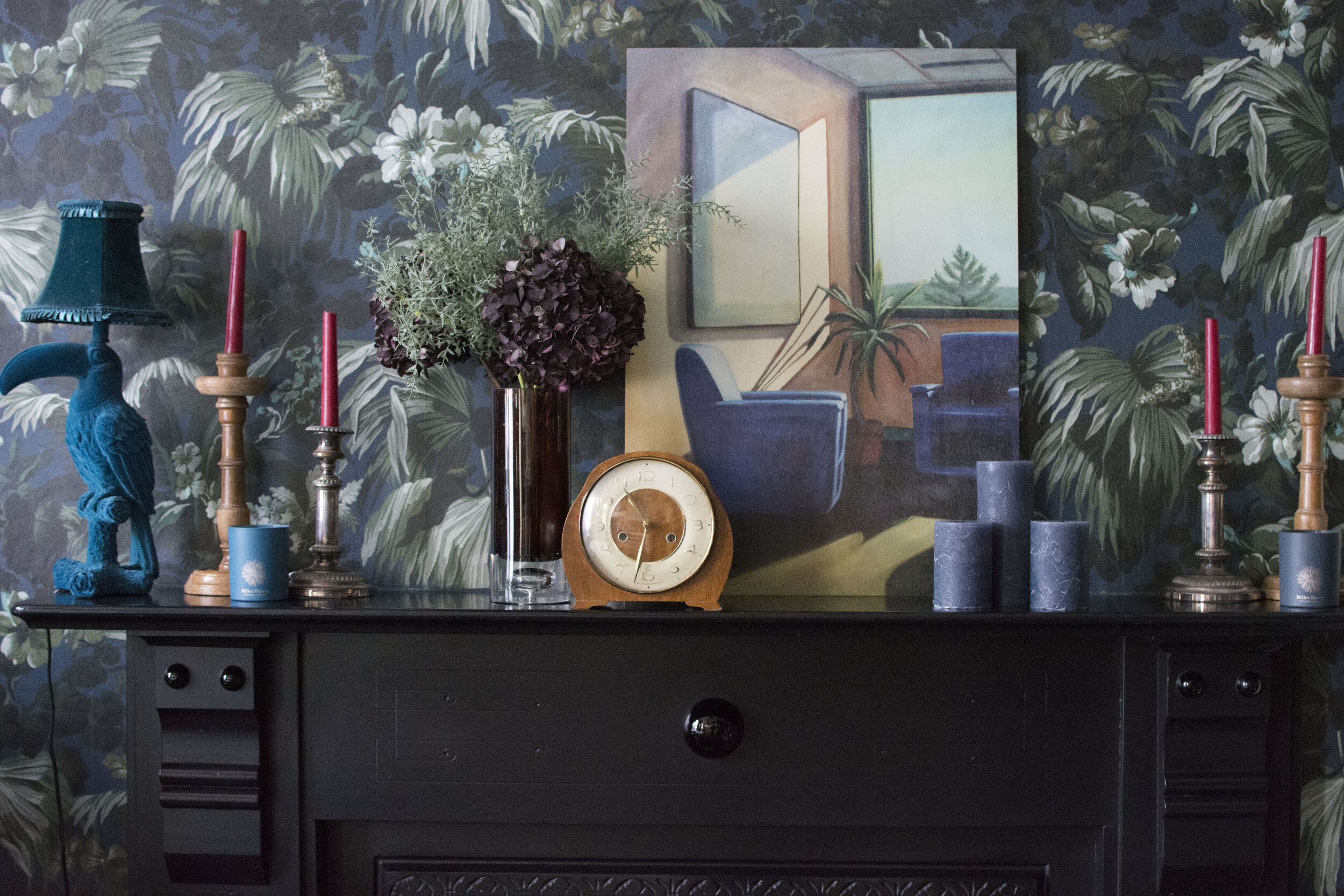
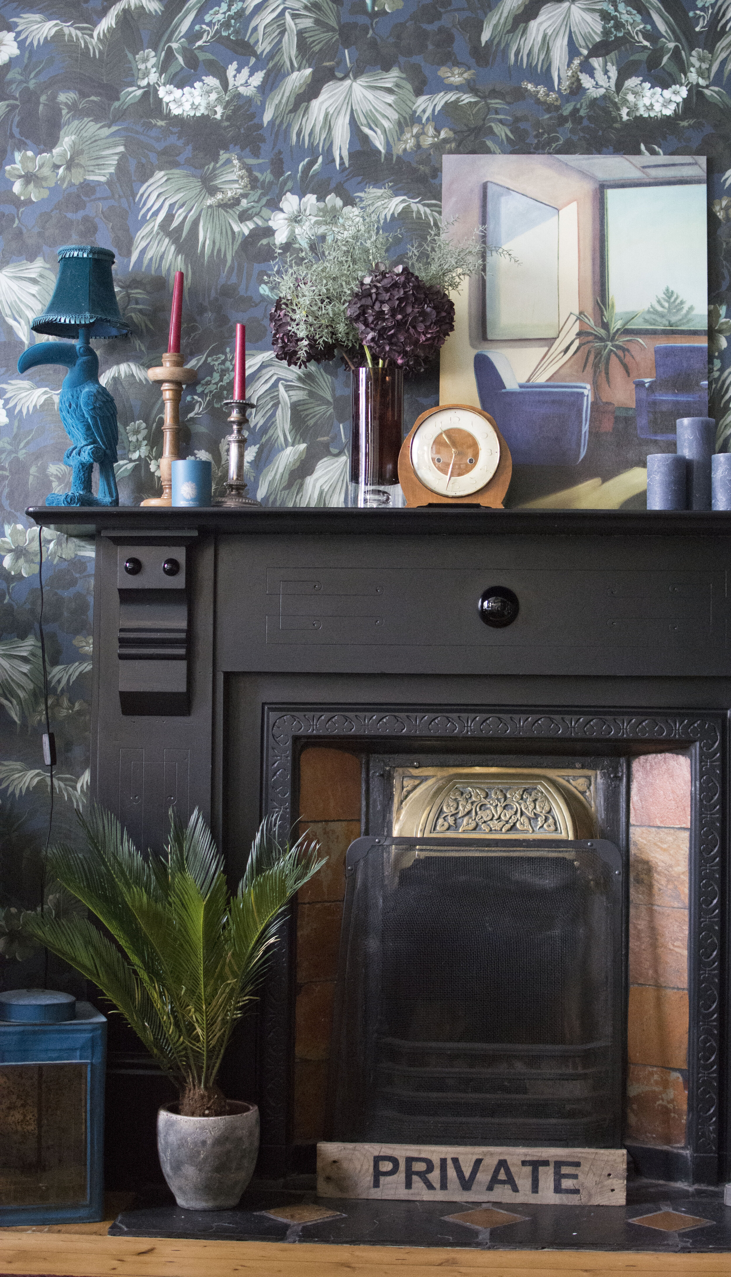
Finally, I chose this wooden print “Entertainment 2002” for the fireplace in my dining room. I liked the mid-century vintage vibe of this print and, as you will have learnt from reading this blog post, I also chose the print because the colour works in the room. The wall colour in the print picks up the tiles in my fireplace, the blue of the chairs picks up the blue in my wallpaper and my candles.
A little bit of insight behind how I choose art for my home. Naturally, there are times when I see a piece of art that just appeals to me and I buy it without any thought to where it is going to go. Sometimes this leads to a change around of art in my rooms, until I find the perfect place. Sometimes I just pop it in a place where it just works.
But if I am choosing art with a thought to my room schemes and where I need to fill a gap in my collection, it is almost always based around not only art that appeals to me, but the colour of the art work too.
This is a paid blog post but the art choices are my own, along with my views on art.

Pin this image to find this blog post at a later date.


